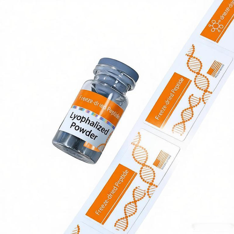
The short answer: a white label is the lower-risk choice for dense copy, small type and repeatable brand color. A clear label creates a cleaner no-label look, but transparent areas borrow their appearance from the glass, product, box and background behind them. That makes contrast planning essential on a small vial.
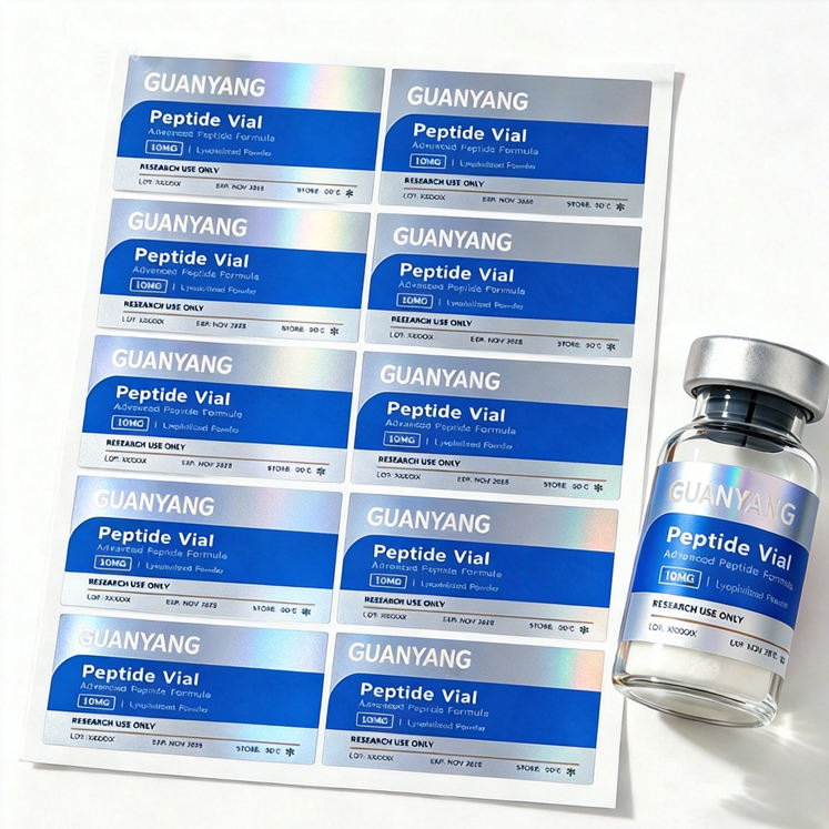
Start with the information that must stay readable
Before choosing a material, rank the content. Product identity, strength, batch or lot field, date field, storage note and any buyer-approved warning copy usually need to survive quick handling. Decorative lines and transparent windows come after those items. If a buyer has to rotate the vial under a lamp to find the product name, the visual effect is working against the package.
| White film | High contrast, stable color and a forgiving background for small text, QR codes and variable fields. |
|---|---|
| Clear film | Shows the bottle and creates a no-label look, but requires deliberate contrast and careful edge planning. |
| Clear film + selective white | Keeps chosen areas transparent while placing opaque white behind logos, color and critical text. |
| Metallic or holographic film | Adds a reflective effect, but usually needs white masking zones where copy must remain calm and readable. |
When white BOPP is the practical choice
White BOPP provides an opaque base, so printed colors are less affected by the vial contents or the shelf behind it. This is useful for multi-SKU systems, fine black text, light brand colors and labels that need to look consistent on clear and amber bottles. It is also easier for a buyer to evaluate from a digital proof because the artwork behaves more like a normal printed page.
A white film label does not have to look basic. Matte or gloss finishes, spot metallic accents, rounded corners and a controlled color band can create a premium result without giving up readability. For a very small diameter, ask for a thin, conformable construction and test the final laminate as part of the label, not as a separate afterthought.
When clear film earns its place
Clear film works well when the glass, liquid or freeze-dried product is intentionally part of the presentation. It can also reduce the visual weight of a label on a tiny vial. The tradeoff is that unbacked ink is not fully opaque. Light colors may look muted, and black text can lose contrast when seen across the far edge of the bottle or against busy outer packaging.
Selective white ink solves many of these problems. The printer places white beneath a logo, color block or text area while leaving the rest of the film transparent. The white layer can be a full flood under the artwork or a custom mask. Ask to see the white-ink separation in the proof, because it is a production layer and not simply another visible color.
Match the label to the vial color
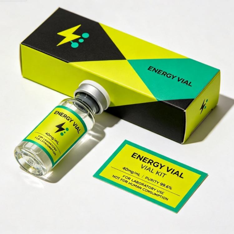
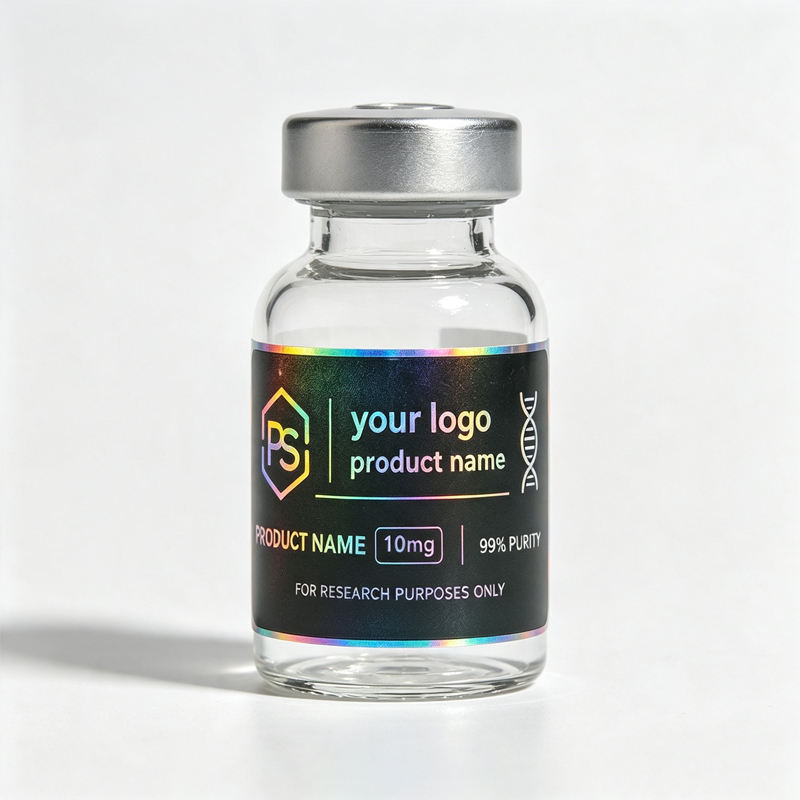
Clear glass gives the most freedom, but it can create double images when copy is visible through both sides of the bottle. Amber and cobalt glass change the apparent color of transparent ink and can make a clear label look darker. A frosted or coated vial may reduce visual transparency and can also change adhesive performance. Send an actual bottle photo in neutral light and identify the vial material when requesting a proof.
Do not confuse clear film with invisible edges
Every pressure-sensitive label has a physical edge. Clear film can make that edge less obvious, but fingerprints, dust, bubbles and a poorly aligned closing edge remain visible. Rounded corners, clean application and a suitable gap or overlap are part of the finished look. On a tight diameter, the face stock and laminate must also be flexible enough to stay wrapped.
Water resistance is a complete construction
Clear and white films can both be used for moisture-resistant labels. Performance depends on the face film, ink system, protective finish and adhesive as a package. Tell the printer whether labels are applied before chilling, whether condensation is expected and how long the label rests before handling. A physical sample on the real vial is more useful than relying on the word waterproof by itself.
Proof checklist before production
- View the artwork at 100% size, not only enlarged on a monitor
- Confirm which areas are transparent and which receive white ink
- Check text contrast on the actual vial color and contents
- Keep critical copy inside the straight-wall application area
- Test barcode or QR performance after the label is wrapped
- Approve the gap, overlap, corner radius and closing-edge position
- Test the complete construction under real handling conditions
What to send for an accurate quote
Send the vial diameter, usable label height, preferred label width, bottle color, artwork, quantity and expected storage conditions. State whether you want a full white base, selective white ink or a completely transparent window. RP can prepare a digital proof if the quote includes one and material direction, then produce a physical sample for final confirmation when needed.
Compare clear and white versions before you commit
Send one bottle photo and your artwork. We can place both material directions into a practical proof so you can compare contrast, transparency and label coverage.
Ask About a ProofFAQ
Are clear labels readable on transparent peptide vials?
They can be, but critical text needs enough contrast against the vial contents and background. Selective white ink can create an opaque base behind copy while preserving transparent areas elsewhere.
Is white BOPP better than clear film for small vial labels?
White BOPP is usually simpler when maximum readability and repeatable color are the priority. Clear film is better when bottle visibility is an intentional part of the design.
Can clear and white vial labels both be waterproof?
Yes. Moisture resistance depends on the entire label construction, including film, ink, finish and adhesive. Test the chosen specification on the actual vial.