Hologram Label White Ink Artwork Guide
Imagine the designer approves the composite image while procurement assumes the name will sit on an opaque field. The file contains no agreed white-layer map. Both teams can point to the same attractive proof and expect different printed results. Settle the intended behavior element by element.
The short answer: place opaque white under logos, light colors, small copy and QR or barcode fields that must read consistently. Omit white under selected shapes where the holographic film should remain visible. Keep the white separation on its own named spot-color layer and approve a physical or moving-light sample.
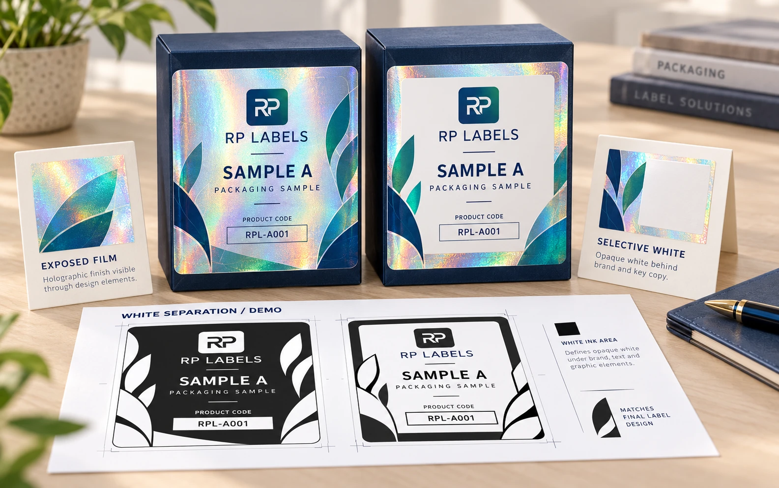
AI-generated packaging illustration. Fictional RP demonstration samples; not an actual order, completed test, authentication or approval record. Any displayed checks or codes are illustrative.
A buyer chooses holographic film because it moves. The designer then covers the entire label with process color and is surprised when every color moves too. Another designer adds solid white beneath everything and turns the expensive holographic stock into a narrow rainbow border.
Both files can express a design direction while leaving the intended printed behavior unresolved.
Why process color changes over holographic film
Process inks are not completely opaque. Printed directly on reflective film, they mix visually with the rainbow substrate. Yellow can appear gold, pink can appear metallic and black may take on a gunmetal movement.
This can be beautiful in bold areas. It can also damage brand color and small text. The artwork needs a map of controlled and uncontrolled reflection.
What white ink does
An appropriately specified white layer can reduce the background influence and provide a controlled base. Color printed over that base behaves more like color on white material. White can also print as a visible design element.
Opacity matters. A weak white layer may still allow the substrate to influence the result. Press process, ink laydown and print sequence should remain part of the approved construction.
Buying rule: every important element should have one declared behavior: opaque, metallic-colored, bare holographic or transparent. If the proof cannot answer which one it is, the artwork is not finished.
Areas that need an explicit white decision
- Small product and legal copy that must remain readable.
- Brand colors that should not change with viewing angle.
- White logos, icons and negative spaces.
- QR codes, barcodes and their quiet zones.
- Serial-number fields and variable-data panels.
Large decorative lines, shield edges, stars or selected logo segments can remain unbacked so the optical material becomes part of the identity.
The startup seal and the security seal
Consider a hypothetical beauty startup that wants a vivid falcon logo on a carton seal. It can use selective white under the brand name and let the wings show rainbow movement. The job is decorative, and the design can take some visual risk.
A contrasting hypothetical warranty label has a different burden. Staff must read a serial number and scan a code under warehouse lighting. That information needs controlled contrast, while holographic movement can sit around it as an inspection feature. The functional panel should not compete with the effect.
Create a separate spot-white layer
Build the white mask as vector artwork on a clearly named spot-color layer according to the printer's specification. Use a visible preview color on screen, but understand that the swatch represents white ink on press.
Keep the dieline and white layer separate. Use overprint settings only as directed. Send editable artwork or a production PDF that preserves spot separations rather than a flattened JPG.
Trap for registration
White and CMYK are printed in separate passes or stations. If their edges match with zero allowance, a small registration shift can create a white halo or holographic fringe. The prepress team may choke the white mask slightly inside colored shapes.
Tiny text and hairline graphics leave little room for trapping. Simplify where necessary and approve at final size, not only in a magnified PDF.
Codes need a quiet, non-reflective field
Holographic movement and glare can interfere with camera-based scanning. Put a stable opaque backing beneath the entire code and quiet zone. Keep it away from tight curves, cut edges and tamper fractures.
Test representative final-size codes on the actual label and package with multiple phones or the intended scanner. A scan from the design monitor does not establish performance on the printed, applied label.
Approve motion, opacity and angle
A static digital proof can show the white mask but cannot reproduce diffractive movement. Review a video under changing light and, for an important project, a physical sample. Tilt it, place it on the final black, white or colored package and inspect it at ordinary viewing distance.
Ask the supplier to identify which areas are white-backed. If the answer depends on guessing from the image, stop before bulk production.
Holographic white-ink checklist
- Holographic pattern or custom-master direction
- Elements intended to remain optically exposed
- Opaque logos, text and brand-color zones
- White-backed QR, barcode and serial fields
- Separate named spot-white layer
- Trapping and minimum-detail review
- Dieline, bleed and tamper construction
- Moving-light and final-package approval
Review one element that must stay still
Imagine the brand name needs a stable opaque field while an adjacent RP motif is intended to reveal the reflective substrate. Reviewing only the composite picture can leave both parties believing the other supplied the mask. The worked element map, blank map and field guide give those intentions separate lines and revision references.
The designer identifies the proposed separation. Prepress confirms its interpretation, layer naming and any relevant allowance for the actual process. The brand owner reviews the resulting appearance through appropriate samples. Avery's artwork guidelines illustrate that a printer may prescribe a named spot-white separation; its exact name and dimensions are not universal RP requirements. Obtain the current printer-specific instructions.
The example code area needs its intended backing and clear margin, but that file decision does not prove the applied code will scan. Keep finished scan evaluation as a separate evidence route. Likewise, a correct separation file does not measure physical opacity or reproduce the optical motion on a screen.
Selective white earns its place when it preserves required identity while leaving the intended effect visible. An intentionally exposed decorative area can also be right; do not mark it wrong solely because another area needs opacity. Send RP the element map, artwork layers, quantity and actual package reference, and ask prepress to confirm the proposed separation and sample approval scope.
Sources and scope
Demand layer: competitor and process pages linked here, including Avery, HERMA or OnlineLabels where cited, illustrate buyer language and process topics only. They do not supply RP minimum quantities, lead times, prices, certifications or materials. Authority layer: an RP number is backed only by a factory datasheet, a signed quote or proforma, confirmed product data, or a fact kept on the About page. The March 2026 proforma there is one production-run example, not a standing offer. RP shipping and planning pages describe what to confirm on a quote. Worked figures on this page are fictional unless an authority source is named for them.