Label PDF Overprint: Review the Separations Before You Approve
A PDF viewed in an ordinary browser is useful for reading copy, but it may hide a production instruction that changes overlapping objects. Before approving a supplement or holographic label, ask the designer and converter to review the actual submitted PDF with overprint simulation and the relevant ink separations. The buyer's job is to confirm the intended result and approve the returned revision.
Do not switch every overprint setting off as a general fix. Some overlaps are intentional. Others may remove a contrast area or change a mark that the buyer expected to stay distinct. Resolve the affected element against its purpose.
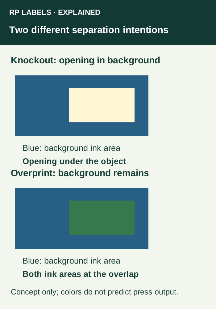
State whether the background should remain under the object
In a simplified knockout arrangement, the background separation has a corresponding opening beneath the object. In an overprint arrangement, underlying ink can remain where the object overlaps it. The resulting appearance depends on the inks, material and production settings; the diagram is a way to discuss the intent, not a color prediction.
For a brand mark on a colored field, ask whether the mark needs an isolated color area or an intended interaction with the background. For a quiet field behind essential text or a code, the reason for the field may be contrast. An instruction that changes that field deserves review before release.
Review the production PDF, with its revision visible
Adobe's current Acrobat Pro instructions describe opening Print Production, choosing Output Preview and enabling Simulate Overprinting, with an appropriate simulation profile. The same guidance warns that the screen result depends on the printer, RIP and output settings. A screenshot with the checkbox enabled is not a physical print approval.
The designer or converter should perform this review using software already available to the project. The buyer does not need to buy a tool merely to ask for the check. Request an identified proof and, where needed, views of the affected separations with an explanation of what the converter intends to produce.
- Identify the exact PDF filename and revision sent for production.
- Mark the element whose background, color or visibility matters.
- Compare its normal view with the simulated overprint view.
- Inspect the relevant process and spot separations to find which ink areas carry that element.
- Return any uncertainty to the designer and converter, then review the corrected PDF and new proof together.
A white-looking area may describe two different constructions
One artwork area may be intended to show the unprinted substrate through an opening in other inks. Another may require actual opaque white ink on a clear or reflective construction. Those are different instructions even when both appear white on the designer's display.
A process-color white object by itself does not establish a white-ink plate. The converter needs to identify the proposed white separation, its coverage and the production treatment. Do not infer an opaque backing from the visible white of a PDF page. The hologram white-ink guide handles which artwork elements should retain reflection; this review checks that the exported PDF expresses the agreed separation intent.
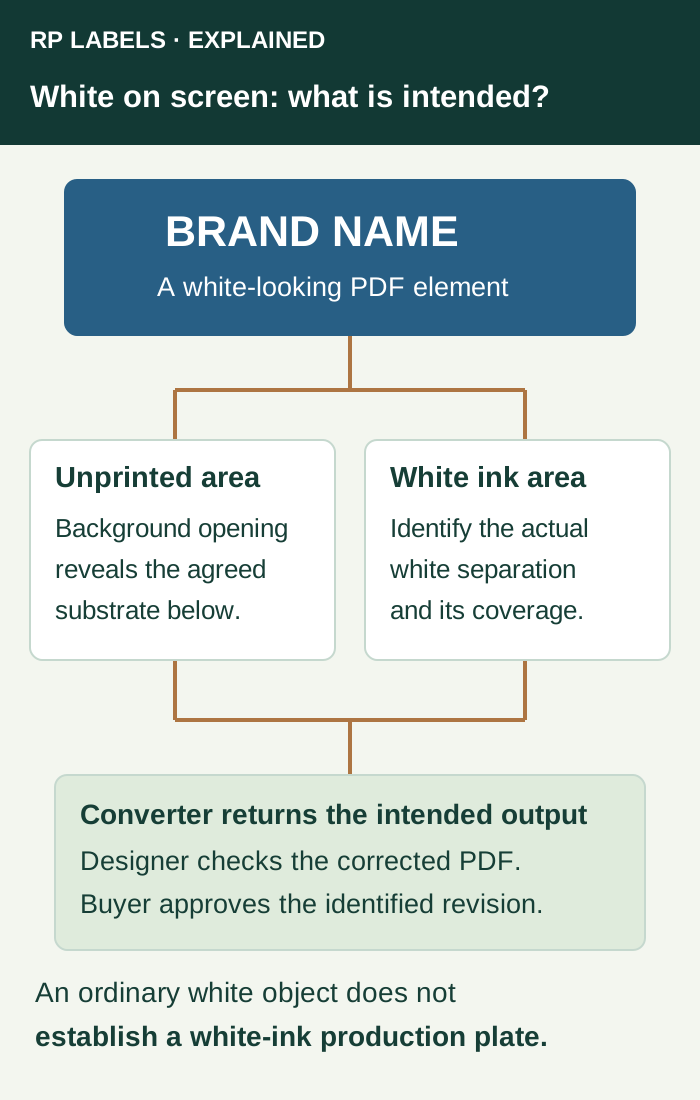
Return a correction the designer can act on
Consider a fictional label revision ART-R4 with a brand name on a dark panel. The buyer intends a clear, contrasting name. The returned separation views do not establish how that area will be produced. A useful comment is: “ART-R4, front brand name: intended result is a distinct light mark on the dark field. Please identify whether this is a knockout to the agreed substrate or a white-ink area, correct the separations if necessary, and return a new proof.”
That comment identifies the file, location, desired behavior and next owner. “Make it print like my screen” does none of those things. If the converter proposes an opaque white underprint, ask it to show the affected coverage so the designer can compare it with the accepted appearance.
For a deliberate overlapping color effect, preserve the intended interaction and ask for the proposed proof scope. A change that solves a white-object problem elsewhere must not silently alter the brand effect. Keep the exception identified instead of applying a document-wide toggle without review.
Know which questions remain physical
Adobe's output-preview documentation explains separation inspection and its limits, including production details that a monitor preview cannot establish. Use the converter to resolve trapping and output behavior; use an agreed physical reference when opacity, reflective appearance or color is essential to the purchase.
Review the proof again after a file correction. A changed export can affect other objects or versions. Confirm approved wording, size and important contrast fields in the returned revision; refer to the proof and physical-sample scope guide when deciding what additional evidence is needed.
Pause approval when an essential mark disappears, its production separation is unresolved or the supplied proof is not linked to the corrected file. Give the issue to the designer and converter rather than approving on the assumption that the press operator will notice.
Bring the intended behavior into the inquiry
When discussing supplement labels or holographic labels with RP, provide the intended material, print-ready PDF revision, quantities per design and an annotated view of any uncertain area. Prepare an inquiry asking for review of the stated overprint, knockout and white-separation intent and the proof available for that job.