Matte vs Gloss Supplement Labels: Approve the View You Actually Sell
A hypothetical brand team approves a matte bottle under soft office light. The product photographer then builds a bright web image and asks why the same navy panel looks flatter than expected. Meanwhile, a glossy alternative catches a highlight across the product name. Both samples can look attractive. Neither has been judged under an agreed selling view.
Choose the finish with the actual artwork, bottle and intended viewing conditions. “Matte looks premium” is not a purchase specification. The useful question is which proposed surface presents the right information and appearance where your customer will encounter it.
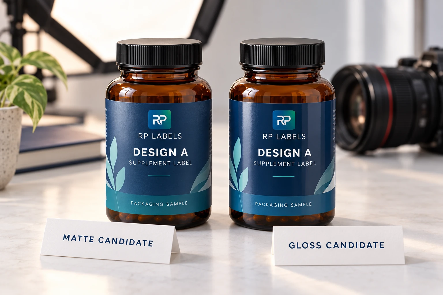
AI-generated packaging illustration. Fictional amber-bottle samples show a finish comparison concept, not measured optical properties or an RP production result.
Two reasonable buyers can choose different finishes
Consider a brand whose main task is helping shoppers identify closely related products on a physical shelf. It may value a restrained surface that keeps the product name easy to find across the relevant viewing positions. A matte candidate deserves consideration, provided its actual printed appearance and handling behavior meet the brief.
Another brand may sell mainly through carefully controlled product photography and prefer the stronger reflected appearance of a gloss candidate. With a suitable lighting setup, that reflection can be part of the intended presentation. It is not automatically a defect just because another buyer prefers less shine.
These are conditional buying situations, not reported customer cases. Neither makes one finish universally better. A finish chosen for controlled photography still needs appropriate physical-pack review. A finish chosen for retail still needs acceptable product images. Identify which view has priority when a genuine conflict remains.
Compare the same artwork before blaming the surface
Put the same released artwork on comparable proposed constructions and the same identified bottle. Record any difference that prevents a clean comparison. If one sample uses a dark field and the other a white design, the preference may come from artwork rather than finish. If one photograph is brighter, it may come from exposure rather than the label.
Keep camera position, lighting arrangement and image treatment consistent for the initial comparison. Then deliberately check the additional views that matter to the actual project. Look at the product name, variant cue and required small copy rather than judging only the largest brand mark. Review the curved sides as well as the flat center of the image.
Do not assume a screen proof can establish the physical result. Avery's artwork guidance explains limitations of electronic color representation in its own process. That supports requesting appropriate physical evidence; it does not supply RP file specifications or guarantee a particular printed match.
If the question concerns exact color approval, keep its evidence separate from the finish preference. A buyer can prefer the reflection of a sample while still withholding approval of its color. Combining the two into one unexplained “approved” makes the next revision harder to manage.
Appearance and protection need separate answers
Matte and gloss describe an appearance direction. They do not, by themselves, tell procurement which protective construction is being quoted. Ask whether the proposal uses a particular coating, varnish or laminate and request its identity within the complete label specification.
Avery Dennison's overlamination bulletin describes both appearance and protective purposes for overlaminates. The important distinction is that protection belongs to an identified construction and relevant use conditions. It does not follow from the word gloss or matte alone.
If the actual complaint is rubbing inside a mailer, use the packed shipping scuff comparison. If the question is which protective process to specify, use lamination versus varnish. Keep this approval focused on viewing and appearance instead of pretending that a beauty review settles shipping performance.
The same separation applies to later coding. If a lot field is printed after finishing, ask the relevant owner to confirm the intended surface, equipment and consumables. An attractive finish is not evidence that an overprinted code will perform as required.
Make the viewing decision repeatable
The worked viewing record, blank record and field guide show two proposed review settings: a defined shelf view and a controlled product photograph. Both candidates use the same artwork reference. Actual observations remain blank until someone reviews the real samples.
The brand owner defines what matters in each view. The photographer records the arrangement used for the comparable images. The artwork reviewer checks that the correct revision was used. Procurement keeps the candidate construction references with the result. If nobody owns one of those inputs, request it before turning preference into an order specification.
Suppose the gloss candidate produces the preferred web image but a reflection obscures the variant at a required shelf angle. There are several honest next steps: adjust and recheck the lighting for photography, revise the layout and obtain a new proof, or choose another finish if the shelf condition has priority. This is an illustrative decision branch, not a measured result. The responsible buyer decides which tradeoff is acceptable.
Conversely, if the matte candidate meets the priority view and the brand likes its appearance, do not add gloss merely because it looks more dramatic in a supplier's unrelated photo. A simple accepted finish has a fair claim to the order. The alternative should win by solving a requirement that actually exists.
Send the preferred view with the quote request
Keep an identified approved physical reference and representative images with the finish decision. Record their limits: a photograph documents an appearance review but does not replace the bottle for tactile or physical questions. When changing the artwork's dark areas, bottle color or protective construction, check whether the old viewing decision still applies.
For custom supplement labels, request comparable quantities, dimensions, artwork revisions and supply scope. Ask each quote to identify the proposed finish construction; obtain actual prices instead of assuming one reflection costs less.
Send RP Labels your viewing brief, artwork, actual bottle reference, quantity per design and the shelf or photography views that matter. Ask which identified finish samples can address that brief, with appearance approval and unresolved physical requirements clearly separated.
Sources and scope
Demand layer: competitor and process pages linked here, including Avery, HERMA or OnlineLabels where cited, illustrate buyer language and process topics only. They do not supply RP minimum quantities, lead times, prices, certifications or materials. Authority layer: an RP number is backed only by a factory datasheet, a signed quote or proforma, confirmed product data, or a fact kept on the About page. The March 2026 proforma there is one production-run example, not a standing offer. RP shipping and planning pages describe what to confirm on a quote. Worked figures on this page are fictional unless an authority source is named for them.