Small Label Text and Rich Black: Choose the Ink Build by Element
Do not apply one dark color recipe to every element of a vial or supplement label. A large background and a line of small copy present different production questions. Ask prepress to identify the actual ink separations and intended overlaps for each, rather than approving “black” from its appearance on a screen.
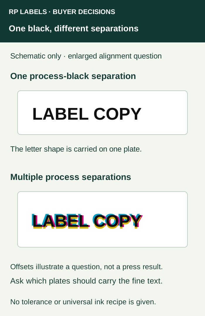
Small copy should not inherit the background’s recipe
A multi-component black can involve more than one process separation. That may be a proposed route for a large dark area, while small letterforms need particular attention to how those components align. The file can look sharply black on a monitor even when the object’s color definition uses several components.
Adobe’s Illustrator trapping guidance cautions against mixed process colors in small type because misregistration can affect readability. That supports asking for an element-level review. It does not prescribe RP’s ink recipe, printer settings or minimum type size.
For ordinary black copy in a compatible process-color job, discuss a single process-black treatment with the converter. Do not turn that discussion into a document-wide conversion. A named spot ink, clear stock, white backing or another specialized construction may require a different accepted instruction. The converter must relate the proposal to the actual print route and material.
Review a large dark field on its own terms
Adobe’s black and overprint explanation distinguishes standard process black from a richer multi-ink build and directs users to their service provider for appropriate percentages. Do not copy a universal CMYK formula into the order. The proposed substrate and printing process matter.
Ask which dark area should look uniform and opaque, how the proposed finish changes it, and which physical reference will govern appearance. A dark panel on white stock is different from a similar-looking panel on clear film with an opaque backing. If the sample does not represent the final construction, keep that difference with the approval.
Mark the elements that need separate answers
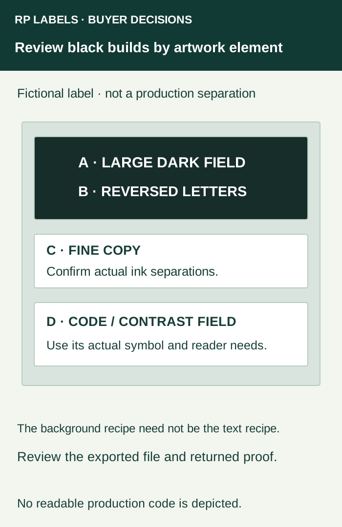
| Element | Question to return to prepress |
|---|---|
| Fine positive black copy | Which separations carry the letters, and is that treatment appropriate for their size and the process? |
| Large dark background | What build, material and physical appearance reference are proposed? |
| Light lettering reversed from a dark field | Which layers define the opening, and can the fine unprinted detail remain clear? |
| Code and surrounding contrast field | What color, backing and finished-surface requirements apply to the actual symbol and reader? |
The same label may therefore need several controlled treatments. A brand owner can approve the intended look while asking the designer and converter to document how it will be produced. The small-text guide covers the separate physical reading task; a technically clean separation does not establish that the finished wording is easy to use.
Keep Registration color out of ordinary artwork decisions
Adobe’s Registration-color guidance explains that this special swatch places an object on every separation. It is intended for relevant production marks, not as a synonym for a rich black brand panel. A black-looking object on screen can therefore represent a different instruction from the one the buyer intended.
Have the designer inspect the actual exported production file. Keep any production marks under the converter’s requirements. Do not replace a questionable color with Registration simply to make it appear darker.
Return an annotated correction and review the new proof
For a fictional ART-R5 label, a useful comment might identify the small ingredient copy and ask the converter to confirm its black separation, while keeping the large background’s proposed appearance unchanged pending review. It names the affected element and desired outcome rather than asking for every black object to be rebuilt.
Use the PDF overprint and separation review to check the returned file. That task establishes how overlapping objects are expressed; this article helps choose which element needs which ink-build question. Keep intentional overprint and knockout decisions visible rather than changing all settings at once.
For vial or supplement labels, prepare an RP inquiry with the production PDF, material proposal, actual label size, quantity per design and the annotated dark/text areas. Ask for the proposed separation treatment and appropriate proof scope. No generic black formula can replace that project-specific answer.