Small Vial Label Text: Approve What the Reader Can Find
The designer can read every line because the designer knows what the line is supposed to say. Before approving tiny vial copy, give the applied sample to someone who has to find the information without that advantage.
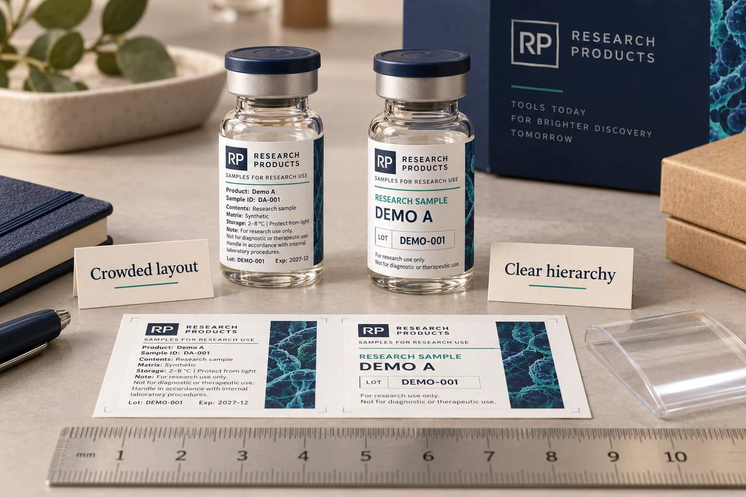
The short answer: stop treating every line as equally important. Build a clear front panel, protect critical identifiers, remove unnecessary copy and approve the label as a final-size print on the actual vial. High-resolution printing cannot restore hierarchy that the artwork never had.
The dangerous proof is the one viewed at 300 percent. On a monitor, every line looks generous. The buyer zooms in, the designer zooms in, and the factory checks fine edges under bright light. Then somebody holds the finished vial at arm's length and asks why the text became shy.
Give the reader a task instead of asking whether it looks clear
'Can you read it?' invites a polite yes. A more useful review asks the intended reader to identify the sample, distinguish the neighboring variant and find the batch field without being told where to look. The buyer should choose the actual critical tasks. This is a practical layout review, not a clinical vision test or a regulatory font-size approval.
Use the identified vial and actual-size print, with ordinary handling light and the viewing method the workflow allows. If routine work permits rotating the vial, allow that. If a rack fixes the view, reproduce that restriction. Record the arrangement so a later proof is not judged under a more convenient condition and declared equivalent.
For an explicit demonstration, put DEMO A and DEMO B into two otherwise similar layouts. Ask the reviewer to report the variant and the LOT field, then compare the response with the controlled artwork. Do not invent a success percentage from the illustration. In a real review, record the exact error, hesitation or search path and the field involved. A misread variant calls for a different correction from text that is simply difficult to locate.
Revise the hierarchy, contrast or available panel before reducing every line again. Ask the approved-copy owner what may move elsewhere; the printer should not remove required physical information to make the test easier. A wider label, separate carton information or another construction may be appropriate only after that review.
Use the reader-task sheet to compare revisions under the same conditions and name who accepts the remaining limitations. A sharp magnified photograph can remain useful for print defects, but it cannot replace this ordinary-size reading decision. Send RP the final copy, critical-field list, actual vial and the marked problem areas so the next proof addresses a specific task rather than the vague instruction to make everything clearer.
Download the worked example CSV · Open the working CSV · Read the field guide. The entries are planning examples, not completed results.
Readability is more than font size
| Typeface | Open letterforms and sensible spacing usually survive reduction better than condensed or highly stylized type. |
|---|---|
| Stroke weight | Very thin strokes can break or lose contrast, while heavy strokes can close small counters when printed. |
| Contrast | Dark text on a stable light field is easier to control than fine low-contrast text over gradients, clear film or reflective material. |
| Spacing | Line spacing, margins and separation between fields affect how quickly a reader can find the right information. |
| Curvature | Text that crosses the side of a small vial leaves the viewer's direct sight line even if the flat proof is sharp. |
The founder who wants everything and the operator who needs three things
A brand may want the vial to carry the full story: product name, code, concentration, storage, batch, dates, URL, QR, company line and a few reassuring claims. Every item is defended as essential because removing it feels like losing value.
The operator handling the vial may need three things immediately: identity, strength and batch. The rest can live on the box, insert or connected page where appropriate. If the critical three are buried inside twelve equal lines, the label has technically included the information and practically hidden it.
The printer cannot decide which statements are legally required or commercially essential. The buyer and qualified compliance reviewer own that decision. Our job is to show, honestly, what the selected area can reproduce and what a person can reasonably read.
Build a hierarchy before shrinking copy
- Primary identifier: the line that must be recognized first on the front-facing panel.
- Secondary identifier: strength, variant or code that distinguishes similar vials.
- Operational fields: batch, date or other variable information with enough room to print or write clearly.
- Supporting copy: information that remains necessary but does not need equal visual weight.
- External information: content that can appropriately move to outer packaging, an insert or a buyer-controlled digital destination.
This order is not a compliance ruling. It is a design conversation that makes compliance review possible without turning every character into the same gray texture.
Clear and holographic films change the equation
On white BOPP, dark text begins with a stable background. On clear film, the vial contents, reflections and whatever sits behind the bottle become part of the artwork. Selective white ink can create readable zones, but those zones need to be specified and proofed.
Reflective or holographic material adds movement. That can be useful for accents and difficult behind fine copy. A label may look impressive while tilted and become tiring to read. If the buyer wants a premium effect, keep the effect and the information panel from fighting over the same square centimeter.
Buying rule: do not ask the smallest text to carry the largest responsibility. Give critical information contrast, space and a stable viewing position.
QR codes need physical room too
A QR code is not free space. It needs a clean boundary, sufficient contrast and enough printed definition for the intended scanner and distance. More encoded information can create a denser pattern, which may be harder to reproduce at a small size.
Test the final code, not a sample code with a shorter destination. Print it at finished size on the final material. Apply it to the vial. Scan several production-equivalent samples from different angles and under ordinary light. A code that works flat on white office paper has passed the wrong exam.
What an approval proof should include
Small-text approval checklist
- Finished label dimensions and actual-size PDF or print reference
- Final approved copy, not placeholder text
- Typeface files or outlined production artwork
- Critical color references and white-ink layers
- Front-facing zone, seam and viewing-window position
- Final QR or barcode data and required scan workflow
- Batch or handwritten field with the intended marking method
- Actual vial and outer packaging relationship
The actual-size test we trust
Print the layout at 100 percent, cut it out and wrap it around the real vial. View it without zoom under the light used by staff or customers. Ask someone who did not design it to find the primary identifier, variant and batch field. Their hesitation is data.
Bring the decision into your print brief
Use the identified references and open items in the worked record when discussing your custom print project. Include the actual package, artwork revision, quantity per design and the conditions explained above; leave unknown inputs marked for confirmation. Review the relevant custom-label service, then send the project details to RP Labels.
Related buying decisions
- Multi-SKU Peptide Vial Labels: What a Visual Inspection Must Catch
- Peptide Vial Labels with a Clear Viewing Window: Keep the Vial Inspectable
Sources and scope
Reviewed October 25, 2026. Primary supplier or official reference supports the identified production concept. Procurement comparisons and worksheets are editorial guidance. Conditional examples are not customer records, completed tests, regulatory approval or universal acceptance standards. Confirm the actual proposed construction and process with the responsible supplier and buyer. Demand layer: competitor and process pages linked here, including Avery, HERMA or OnlineLabels where cited, illustrate buyer language and process topics only. They do not supply RP minimum quantities, lead times, prices, certifications or materials. Authority layer: an RP number is backed only by a factory datasheet, a signed quote or proforma, confirmed product data, or a fact kept on the About page. The March 2026 proforma there is one production-run example, not a standing offer. RP shipping and planning pages describe what to confirm on a quote. Worked figures on this page are fictional unless an authority source is named for them.