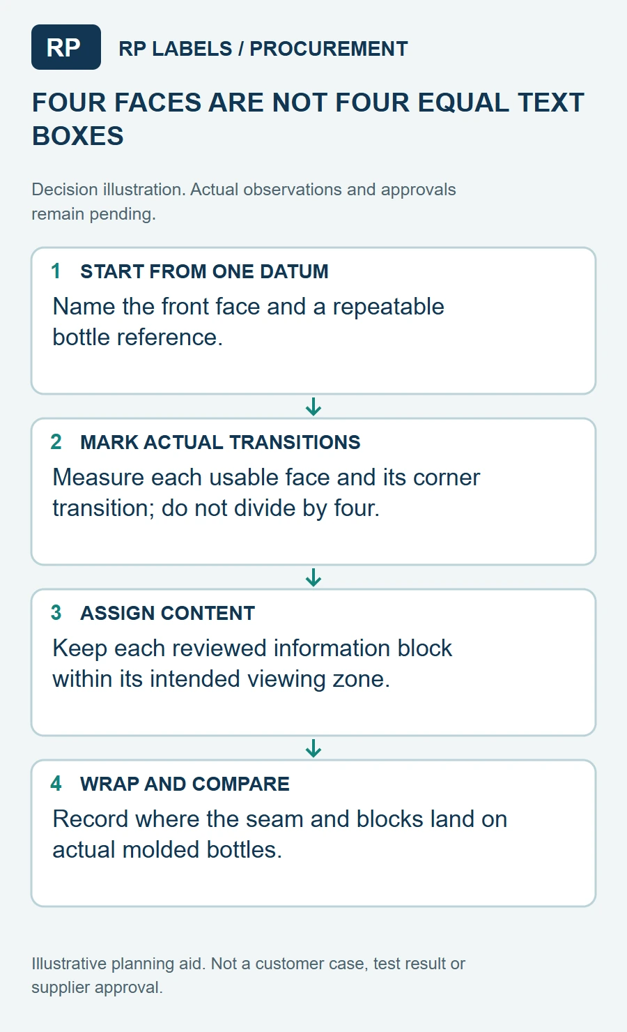
A wrap label for a round bottle can be divided by angle. A square supplement bottle invites a different mistake: the flat design is treated as one long rectangle, even though the buyer will read it as separate faces. Text crossing a hard corner can look broken; a barcode near that edge may no longer sit on a reliably readable plane.
I would start with the empty bottle in hand and mark the four real faces. Then I would put the front display, required information, optional marketing copy and barcode in zones that can be seen without twisting the label around a corner. This is a layout exercise before it is a typography exercise.
Give the principal display its own face
For a U.S. dietary supplement, FDA's labeling guide describes the principal display panel and information panel and identifies the statement of identity and net quantity for the principal display. On a square bottle, the front flat face is the natural starting point, but the brand's regulatory reviewer must decide the actual compliant layout, including whether alternate principal display panels exist.
FDA's net-quantity chapter distinguishes rectangular or square package panel area from cylindrical area. That is a reminder not to reuse a round-bottle sizing assumption. The usable printed width is further reduced by the corner radii of the actual molded bottle and by label placement tolerance.
Reserve a whole readable information zone
The Supplement Facts box, ingredient statement and business information cannot be treated as decorative leftovers. FDA describes what belongs on the information panel and where it sits relative to the principal display. Build this zone first, at the text size and line spacing the brand's reviewer approves, then let decorative graphics occupy what remains. If one face cannot hold the required material, explore another packaging format or panel arrangement with the reviewer before squeezing it.
Keep the label's vertical corner transition free of narrow columns of copy. A sharp fold changes the viewing angle and can add a slight label bridge. For barcodes, GS1's retail 2D guidance cautions about folds, print-surface interference and quiet zones. A flat face is a better test location than a corner, though the chosen symbol still needs verification on the applied pack.
Proof on the molded bottle
Print a scale proof with crop marks and place it on the exact bottle, including the closure. Rotate it through the intended shelf views. Can a customer identify the product without a corner splitting the name? Is the information panel immediately readable when the bottle turns? Does the barcode remain on a flat, accessible section? Check the back seam as well: it can drift if hand-applied or if the machine index changes.
For a multi-SKU line, I would check the longest product name and the densest approved facts panel first. A layout that only works on the shortest name can quietly force a new dieline later. Mark a consistent safe area on every flat face and keep the bar-code location stable between variants so the receiving and shelf workflow does not change each time a new flavor or count is added.
Sources and scope
Reviewed October 3, 2026. The primary references linked below support the identified technical points. Buying scenarios and inspection checklists are editorial guidance, not RP production records, certification, legal approval or universal acceptance standards.