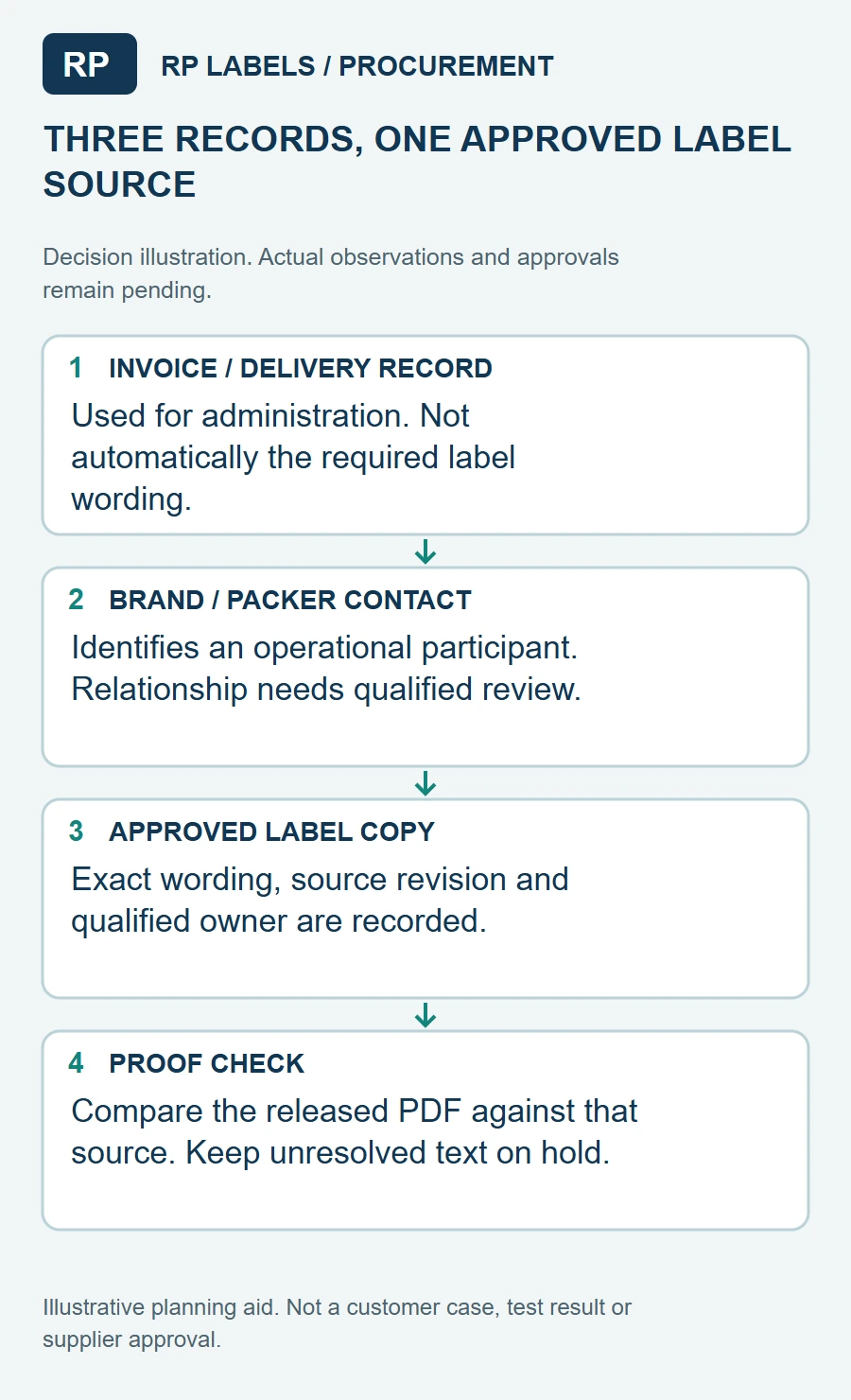
One line near the edge of a supplement label often triggers more email than the entire front design: whose business name and address should appear? A brand, a contract packer, a distributor and a label printer may all be involved in one order. The printer should not pick the name simply because that company supplied the artwork.
My first question would be who is responsible for approving the product's market-facing legal copy. Ask that owner to provide the exact business line, including its relationship wording and address details where required. The label supplier's job is to preserve the approved wording, place it legibly and keep versions from being mixed.
Why the line matters in the layout
The FDA's dietary supplement labeling guide, Chapter I includes the name and place of business of the manufacturer, packer or distributor among the generally required label statements. It also explains information-panel placement and lists address elements. That is a U.S. reference, not a universal rule for every country. For another market, the brand should check the applicable local requirements rather than reusing a U.S. proof as-is.
On a narrow wrap label, that business line competes with Supplement Facts, other ingredients, barcode, lot space and sometimes a QR code. If it is not included in the first dieline, it tends to be squeezed into whatever gap remains. A line that fits in a design file may disappear into the curve or seam when applied. Reserve a measured block for it with the full approved text, not an empty rectangle with a guessed width.
Do not let a placeholder become production copy
Internal proofs often carry labels such as "manufacturer address TBD". That is a useful review flag only while the file is clearly controlled as a draft. Before printing, the artwork owner should replace the placeholder, verify spelling and punctuation, and sign off the final PDF. If the buyer changes distributors later, create a new artwork version and identify any rolls of the older version that remain in stock. This is a supply decision as much as a design decision.
I would keep a short approval table: SKU, destination market, approved business-line text, artwork file name, approval date and approver. If several brands use the same bottle and general layout, do not assume the responsible business line carries over. A consistent template can still contain different legal copy. The label supplier can compare files against the supplied table before releasing print-ready artwork.
Review the whole bottle at finished size
Place the approved copy on a full-size proof and wrap it around the real bottle. Hold the bottle as a buyer would: front panel first, then rotate toward the information panel. Is the line readable without unfolding a label or peering under the lid? Does the seam cut through the address? Does a retail or warehouse barcode need the same space? If one field forces another into a corner, decide which element can move before approving the print run.
Do not use a QR code as an automatic substitute for required on-pack copy. Digital information can be useful, but the product owner should determine what must remain printed for the relevant market. Likewise, a glossy finish or smaller font does not resolve a missing legal approval.
A cleaner custom-label handoff
Send the bottle reference, dieline, approved market-specific text, contact/business line, facts panel, ingredient copy, barcode and any changeover date. Ask for a proof that flags every variable field and a physical applied sample. When these arrive together, the printer can focus on accurate reproduction and the brand can focus on the truth of the copy. That is a better division of work than discovering at dispatch that the wrong company name appears on a beautiful roll.
Sources and scope
Reviewed October 2, 2026. The primary references linked below support the identified technical points. Buying scenarios and inspection checklists are editorial guidance, not RP production records, certification, legal approval or universal acceptance standards.