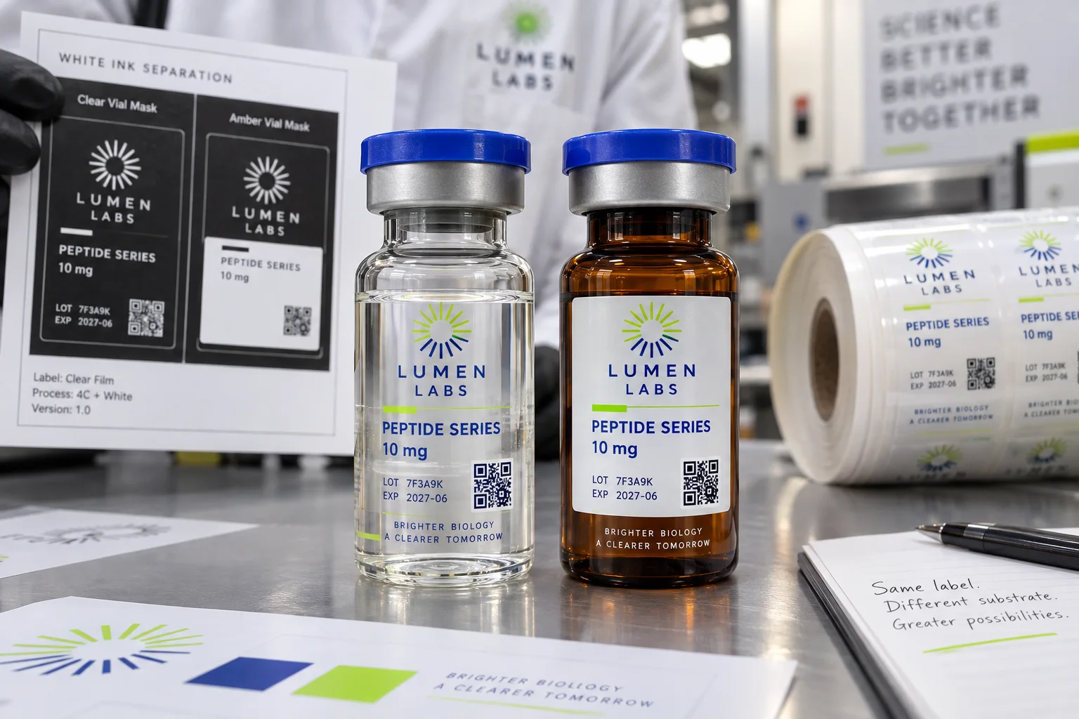
The short answer: put white ink beneath text, logos, light colors and scan areas that must remain stable. Leave white out where the vial should show through or where translucent color is intentional. An amber vial usually needs a more deliberate opaque panel than clear glass because the brown background shifts unbacked colors.
Clear labels on dark amber dropper bottles usually need white ink under the artwork so the design stays readable. Final appearance depends on bottle color, curvature, and the white-ink coverage, and should be checked on a proof or sample. This page does not promise a specific look from a photo alone.
A buyer sends a transparent PNG and asks for a clear label. On screen, the white logo looks white because the artboard is white. In print, CMYK has no white ink. The logo disappears unless a separate white layer is specified.
The opposite mistake is just as common. The printer floods white behind the entire label to keep everything safe. The product arrives looking like a white BOPP label with a faint transparent edge. Technically correct, commercially disappointing.
White ink creates the printing surface
Process colors rely on reflected light. On clear film, they are translucent and take on the color of whatever sits behind them. White ink creates a controlled neutral foundation, improving opacity and color stability.
On a clear empty vial, an unbacked blue may look bright against a white table. Fill the vial, place it in a dark box or hold it in a hand, and the same blue changes. Approve the label in its real context.
Clear glass and amber glass are different canvases
Clear glass can support a floating no-label look when dark graphics and sufficient contrast are used. Amber glass adds a strong warm background. Lime, pale blue and fine gray copy can lose clarity quickly without white beneath them.
A design that works on clear glass should not be copied unchanged to amber. The brand may keep transparent windows around the edges while adding an opaque information panel behind the product name, dosage, lot and QR code.
Buying rule: decide transparency by element, not by label. The logo can be opaque, the molecule pattern translucent and the background fully clear in the same construction.
Three practical white-ink directions
| No white ink | Maximum transparency, but colors interact strongly with the container. Best only when that effect is intentional and readability is proven. |
|---|---|
| Selective white | White sits behind chosen logos, text, color blocks and codes while other areas remain clear. |
| Opaque panel | A larger white foundation creates predictable reading space while a clear perimeter preserves some no-label appearance. |
Protect QR codes and batch fields
A QR code needs stable contrast and a clean quiet zone. Do not place it over liquid level, dark amber glass or a busy transparent graphic and hope every phone will compensate. Use an opaque backing field and test the final printed size on the curved vial.
Batch fields need the same thought. If variable data will be overprinted later, confirm the ribbon or ink color, white foundation and finish compatibility.
Registration and trapping
The white layer and color layers must register. If white ends exactly at the edge of tiny lettering, a small shift can create a white halo or color fringe. Prepress may choke or spread the white mask slightly according to the press process.
Very thin lines and tiny reversed type leave little room for that adjustment. Simplifying a small icon often gives a cleaner result than asking the press to reproduce screen-sized detail.
Build the file as layers
Create the white ink as a separate named spot-color layer according to the printer's instructions. Keep it distinct from CMYK artwork, dieline and special finishes. Use overprint preview to understand which areas are backed and which expose the clear film.
Do not use ordinary CMYK white as a substitute. In process printing, that usually means no ink.
Finish and adhesive still matter
Clear film shows bubbles, dust and application marks more readily. A high-clarity construction, clean vial and controlled application pressure support the visual result. Matte finish can create a frosted effect; gloss keeps more transparent depth.
White ink does not solve adhesion, condensation or edge lift. Those remain material and process decisions tested on the actual bottle.
Clear-label artwork checklist
- Actual clear or amber vial and fill appearance
- Areas intended to stay fully transparent
- Logo, text and colors requiring opaque white
- Stable white-backed QR or barcode field
- Separate named spot-white layer
- Registration and minimum-detail review
- Gloss, matte or protective finish
- Final-size printed sample on the vial
Approve a four-region coverage plan before the mask is exported
A useful white-ink brief names each part of the design and the appearance the buyer intends. For a fictional clear-film label, divide the artwork into four regions: A is a light brand mark that should remain distinct on amber glass; B is a colored decorative accent intended to stay translucent; C is a code field requiring a stable contrasting background; D is a deliberate viewing window.
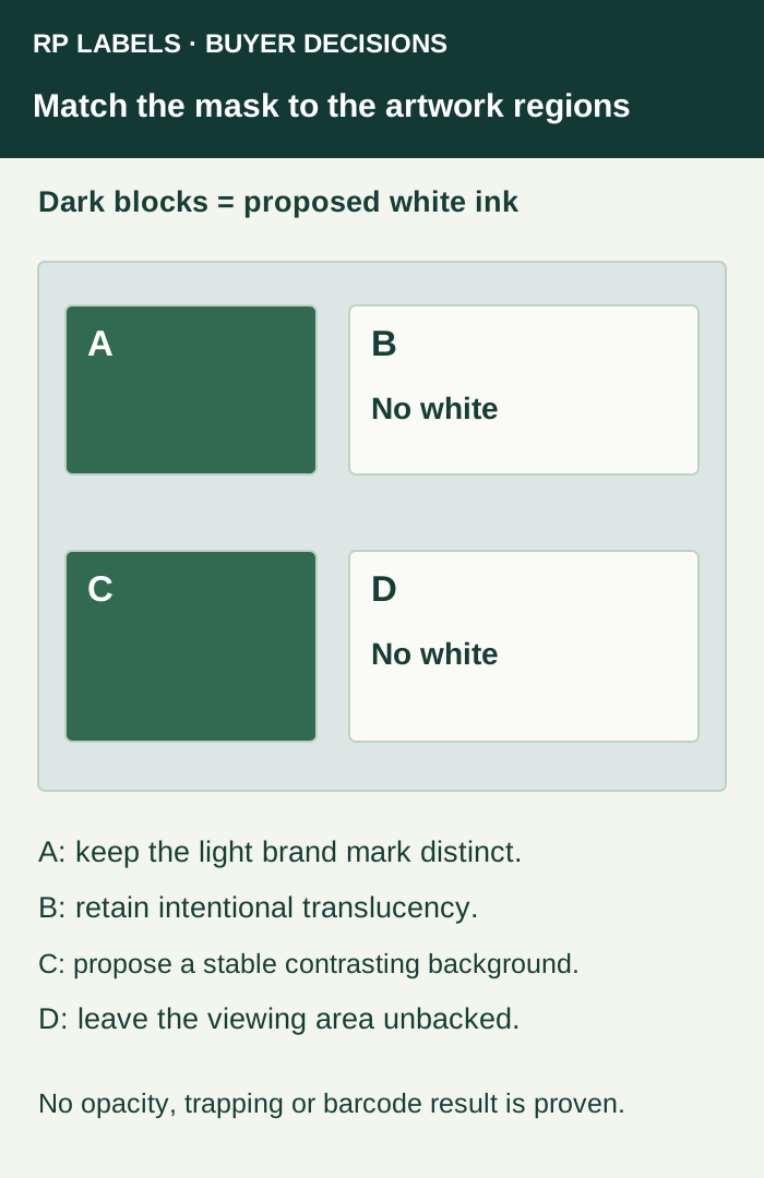
The proposed mask backs A and C while leaving B and D without white. This is a starting design intention, not an opacity specification or a passed print. The converter still needs to confirm the proposed ink construction, practical registration treatment and physical evidence. A different brand brief can legitimately choose different regions.
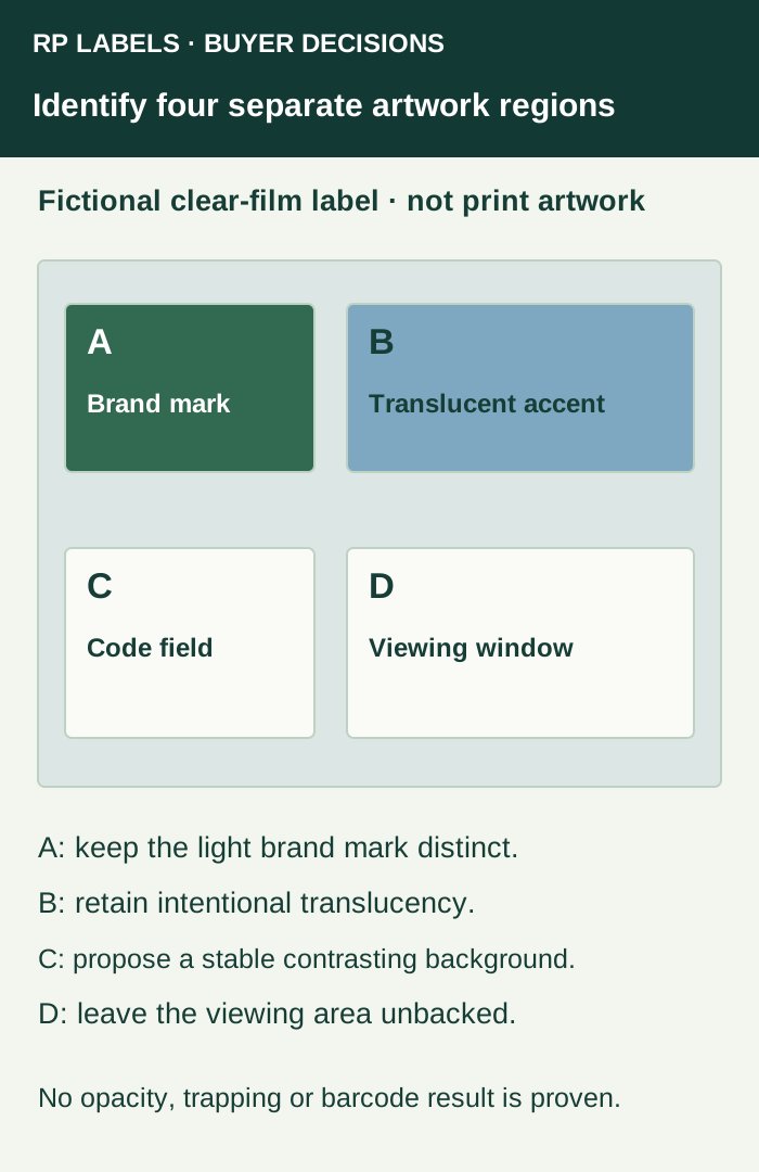
Give the designer the region identifiers and the actual vial reference. Have it return the visible artwork and the corresponding white-only view under the same revision. The buyer should be able to trace A to A and C to C without guessing from a colored overlay. White displayed on a PDF page must not be mistaken for proof that an actual white-ink separation exists.
Test two different changes without approving the wrong one
If the converter adds white to B, the accent's intended translucent behavior has changed. If it adds white to D, the viewing window has been closed. The buyer can catch both scope changes by comparing the two region views before paying for another physical sample.
If the proposed physical sample has insufficient contrast in A or C, ask which identified construction or layout change is proposed and review that change on the actual vial. Increasing white coverage everywhere can destroy B and D while still leaving the code's applied performance unverified. Confirm essential contrast, appearance and any code verification as separate evidence items.
Adobe's output-preview guidance explains inspecting separations and the limits of a monitor preview. Use the PDF separation review for the exported-file check; this coverage plan defines the element-by-element appearance the file should express. Send RP the marked regions, vial reference, artwork revision and quantity when asking which white-printing and sample scope can be proposed.
FAQ
Why is white ink needed on clear vial labels?
Process inks are translucent. White creates an opaque foundation so light colors, small text and codes are not changed by the vial behind them.
Should the entire clear label receive white ink?
Not always. Selective white can support critical graphics while leaving planned transparent windows. Full white coverage can remove much of the no-label effect.
Does an amber vial need more white ink?
Amber glass strongly influences unbacked colors, so important text and brand colors often need an opaque foundation.
How is white ink shown in artwork?
It is normally prepared as a separate named spot-color layer. Confirm naming, overprint, trapping and detail requirements with the printer.