Holographic vs Foil Labels: Specify the Reflective Area
One supplier means a rainbow background; another means a metallic logo. Both quotes say foil. Before choosing the finish, mark the part of the artwork that is supposed to reflect and the part that must stay calm.
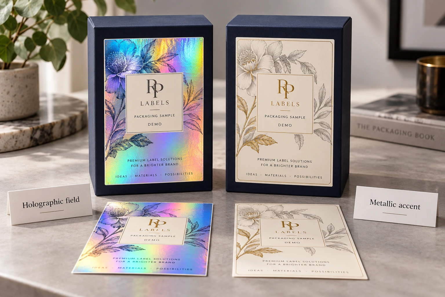
The short answer: holographic and foil are not interchangeable names for "shiny." Holographic effects shift with the viewing angle and can cover the full label or form a custom security pattern. Foil is often used selectively to make a logo, rule or short line of type metallic. Ask the printer to name the proposed construction and show where the reflective layer appears.
Separate the visual effect from the way it is produced
Holographic describes an optical appearance; foil can describe a material or transfer route, and a foil itself can be holographic. A binary request for 'hologram or foil' can therefore compare overlapping options. Ask the supplier to name the proposed material, printed layers and transfer or finishing route rather than relying on the shorthand in a reference-image caption.
Make a simple area map for the actual artwork. Identify the zones intended to show broad reflective movement, any selected metallic accents, and the text or code zones that need a stable background. The map states what the buyer wants to see. It does not prescribe an unconfirmed production method or guarantee that every layer combination is available from a particular printer.
In the demonstration, one direction uses a broad holographic field with a calm information inset. The other keeps most of the panel quiet and uses a small metallic brand accent. Both can be deliberate choices. A pack that must be recognized through a moving reflective feature may favor the first; a long wordmark and restrained front panel may favor the second. Neither choice establishes a security function.
Ask for a physical sample on the proposed construction and look at it on the intended package. Check whether the main mark remains recognizable when the highlight moves, whether the information inset does its job and whether any reflective-to-printed boundary needs a registration review. Record the sample and layer revisions together; a screenshot taken at the most flattering angle is a limited reference.
Use the area-map worksheet with the source artwork and a marked reference photo. Keep color and finish approval distinct from an applied scan or opening check, if those functions exist. Send RP the desired reflective zones, label dimensions, package, quantity and application route, and ask what construction is actually proposed. Choosing the visible job first makes the process comparison less dependent on ambiguous words such as 'premium' and 'foil'.
Download the worked example CSV · Open the working CSV · Read the field guide. The entries are planning examples, not completed results.
Compare the visual job
| Holographic film | Creates moving rainbow or patterned reflection across broad areas. Printed white layers can mask selected zones. |
|---|---|
| Custom hologram | Uses a designed optical image, logo or security pattern. Setup, artwork and quantity requirements are project-specific. |
| Foil accent | Places metallic color on selected logos, text or borders for a controlled premium signal. |
| Metallic ink | Can suggest metal but does not produce the same mirror-like transfer or optical movement. Confirm with a physical sample. |
Use holographic effects when movement is part of the message
Holographic material can make a seal, logo sticker or promotional label visible from different angles. It is useful when a buyer wants overt visual impact or a recognizable security cue. Because the background is active, the artwork should include calm zones for product names, QR codes and fine print. Selective white ink can block the holographic effect behind those areas.
Use foil when the accent should stay controlled
Foil works well for a short logo, key line, border or premium detail on a bottle label or carton. It can support a quiet design without turning the entire label reflective. Very fine reversed type and tight registration need careful artwork review. Ask whether the project uses hot foil, cold foil or another metallic process because the production limits are not identical.
Readability needs its own layer plan
Reflective backgrounds reduce contrast when they pass through small text or a scannable code. Prepare a white-ink mask or an opaque printed panel behind critical information. Keep the largest visual effect away from barcodes and variable data. Review the art at actual size and under more than one light angle; a flat screen preview cannot show the complete optical result.
Security purpose changes the specification
A decorative holographic appearance does not by itself establish resistance to copying or a complete authentication system. Specify opening evidence, controlled recognition or identifier checking as separate requirements and evaluate the proposed construction and workflow.
Artwork should identify reflective and opaque zones
Send vector artwork when possible. Separate the printed color, white mask, foil or holographic area, cut line and variable data into clearly named layers. Outline fonts, include bleed and avoid building fine security lines from low-resolution raster images. A digital proof can confirm layer intent, but a physical sample is the reliable way to judge reflection, registration and small-text clarity.
Finish selection checklist
- Is the purpose premium branding, visual attention, tamper evidence or authentication?
- Should reflection cover the full label or only selected artwork?
- Which text and codes need an opaque background?
- Will the label sit on glass, plastic, paperboard or a flexible package?
- Does the finish need to align with a die-cut shape or package opening?
- Are labels applied by hand or supplied on equipment-ready rolls?
- Has the effect been approved from a physical sample in real lighting?
What to send for an accurate comparison
Compare the effect before choosing the process
One reference image and a package photo are enough to start a practical finish discussion.
Request a Finish ProofBring the decision into your print brief
Use the identified references and open items in the worked record when discussing your custom print project. Include the actual package, artwork revision, quantity per design and the conditions explained above; leave unknown inputs marked for confirmation. Review the relevant custom-label service, then send the project details to RP Labels.
Related buying decisions
- Foil or Metallic Ink on Supplement Labels: Approve the Finish After Protection
- Decorative or Security Hologram Labels? Give the Feature a Job Before You Buy It
- Hologram Label White Ink Artwork Guide
Sources and scope
Reviewed October 25, 2026. Primary supplier or official reference supports the identified production concept. Procurement comparisons and worksheets are editorial guidance. Conditional examples are not customer records, completed tests, regulatory approval or universal acceptance standards. Confirm the actual proposed construction and process with the responsible supplier and buyer.