A metallic finish is often chosen on the front of a supplement bottle because it catches light at a glance. The trouble begins when the same sheen runs through small Facts text or behind a retail code. What looks luxurious under studio lighting may be tiring to read in a shop and unreliable under a scanner's light.
I would make the finish decision by zone. Let foil or metallic ink serve the brand mark and controlled accents; give the facts, ingredient copy and barcode their own neutral, non-reflective field. This is not an argument against metallic labels. It is a way to use the effect without making the information harder to use.
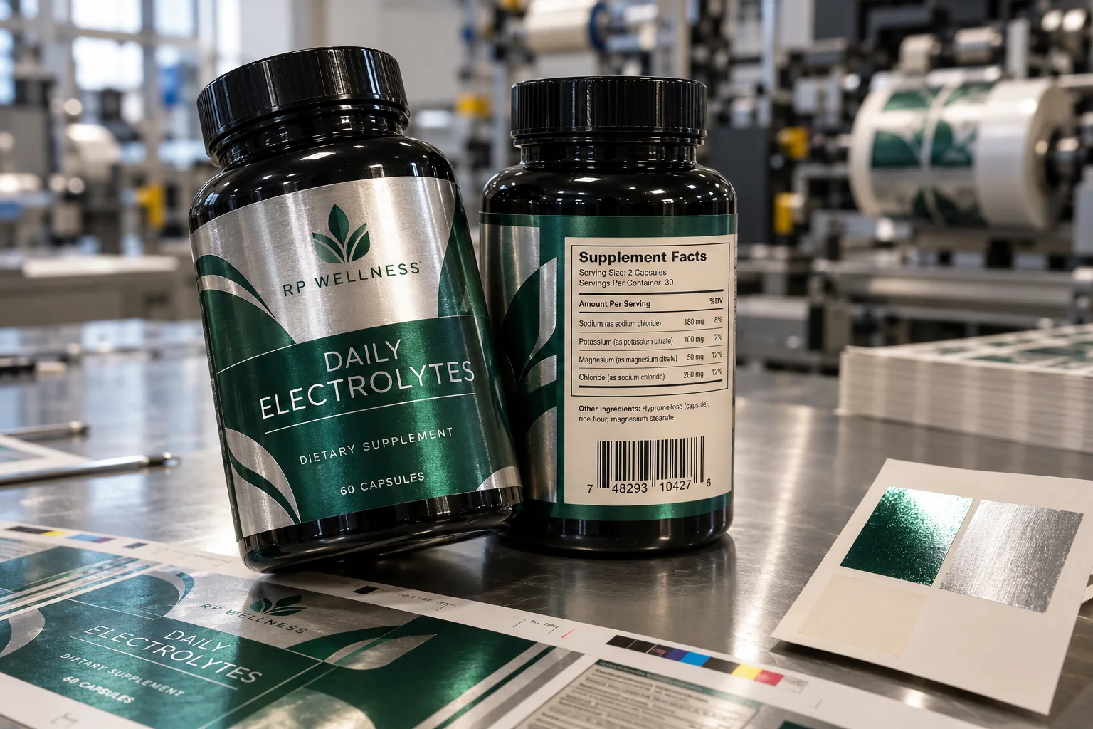
Keep regulatory text on a calm background
FDA's dietary supplement nutrition-labeling guide describes the Supplement Facts presentation, including black or one-color type on a white or neutral contrasting background whenever practical. It also covers type and rule requirements that depend on the actual package. A decorative metallic field is a poor place to begin laying out this information, even if the final visual proof seems elegant.
Give the brand's qualified regulatory reviewer the full-size proof, not just a bottle rendering. Ask them to approve the actual formula copy, heading, line order and spacing. The pictured example numbers are fictional layout art and must not be copied onto a real supplement bottle.
Specify the barcode as a separate job
GS1's barcode guidance favors dark bars and a light background for contrast. Its 2D color guide explicitly warns against printing 2D codes directly on shiny or reflective material. The principle matters to the design brief: a code field is not just another graphic detail. It has size, quiet-zone, contrast and reflectance requirements that depend on the code type and scanner.
Put the real assigned value on a neutral panel of appropriate dimensions. Keep foil boundaries, overprint, seams and curvature outside the quiet zone. Test the production-representative applied label with the actual point-of-sale or warehouse equipment and the data owner present. A mock barcode in an AI image is not proof that a real symbol will scan.
Ask for a materials-and-finish proof
Request swatches of the intended face stock, metallic treatment, matte or neutral information area, and protective finish. Compare those swatches under daylight and the lighting where the buyer expects the bottle to be seen. An all-over gloss laminate can bring back reflections even when the code panel was designed with a light background.
Have the printer mark the finish map separately from the artwork: foil area, overprint color, uncoated or matte information field and any varnish boundary. That makes the approval conversation specific. If a silver substrate is used under the whole label, the pale panel may need an opaque backing layer rather than merely a lighter ink color. Ask for that layer in the separation proof and inspect its registration at the boundary so thin metallic slivers do not enter the code's quiet zone.
Finally, compare the code before and after the planned protective finish is applied. A bare press sample and a laminated bottle may return different reflections to the scanner. If the brand needs a full metallic wrap, consider whether the code belongs on a different panel or outer carton, but only after the barcode owner confirms that the placement works for the actual sales channel.
For a quote, share the physical bottle, approved copy, exact barcode specification, the metallic effect reference, finish map and application method. Ask for a flat proof plus an applied sample. The best premium decision is one in which the brand accent attracts attention and the mandatory information stays boringly easy to read.
Sources and scope
Reviewed October 3, 2026. The primary references linked below support the identified technical points. Buying scenarios and inspection checklists are editorial guidance, not RP production records, certification, legal approval or universal acceptance standards.