Vial Label Color Matching: Choose a Physical Master for the Reorder
A repeat vial label arrives beside the original carton and the two teals look different. The file still uses the same color values. In this hypothetical review, the missing item is the approved physical target and the conditions under which the pieces were supposed to match. Naming an ink is useful; naming what the buyer will compare is more useful.
One person compares the new label to a carton on the shelf. Another opens the original artwork on a bright laptop. Both can sincerely say the color is wrong and mean different targets. I would put the retained finished sample on the desk first. The discussion becomes much calmer when everyone is looking at the same object.
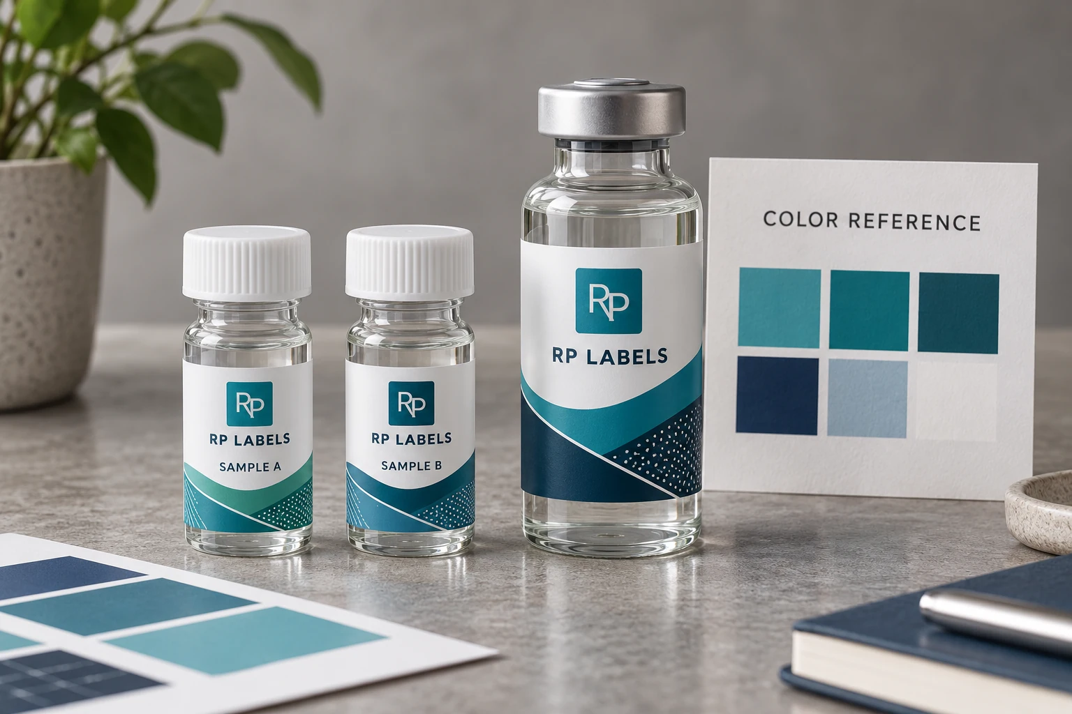
AI-generated packaging illustration. Fictional RP samples show the proposed decision; no physical test or customer order is documented.
Make the color master survive the next purchasing handoff
Record the reference sample, its substrate, printed finish and the element that matters. A logo may be color-critical while a background illustration is not. If the target is a coordinated vial-and-carton set, identify both pieces and the intended visual relationship instead of assuming identical numbers will create identical surfaces.
The worked master record keeps the proposed CMYK route and a proposed spot-color route as alternatives. No color tolerance or production result is invented. The supplier should state what each proof represents: layout only, a material appearance example or a production-representative sample. The buyer then knows which approval is still missing.
Have the designated reviewer compare the same physical references under the agreed viewing conditions. Record a disagreement specifically: logo too blue relative to retained label, or carton darker after the selected finish, for example. A phone photograph can help explain the issue remotely, but its display and capture settings do not replace the agreed physical comparison.
For a multi-SKU short run with gradients, an approved process-color appearance may be entirely adequate. A brand-critical solid color repeated over time may justify discussing a spot ink or another controlled route. That is a print-process discussion with the supplier, not a promise that a named color bypasses substrate and finish effects.
Send RP Labels the retained sample reference, materials, finish and which area is protected. Keep a second identified reference where the project requires it, so a reorder does not depend on a single faded or damaged piece. The next buyer should inherit the reason for the match as well as the artwork file.
What CMYK is good at
CMYK builds the design from cyan, magenta, yellow and black dots. It handles photographs, shadows, gradients and multiple SKU colorways efficiently. It is often a practical choice for digital production and smaller custom runs because the press does not need a separately mixed ink for every brand color.
Its weakness is not that it is "cheap." Its limitation is gamut and process variation. Some bright blues, greens, oranges and saturated brand colors cannot be reproduced exactly with four process inks. A value copied from an RGB file can shift again when converted for print.
What a Pantone spot color changes
A spot color is specified as a named solid ink reference rather than rebuilt from four screened colors. That can produce a cleaner, more repeatable solid logo or band. It also gives the buyer, designer and printer a common language that is more useful than "the blue on my monitor."
Spot color is not automatic perfection. A Pantone reference printed on coated paper is still not the same object as ink printed over white BOPP, clear PET with white ink beneath it, or carton board with matte lamination. Ink film, opacity, substrate and finish all influence appearance.
The vial buyer and the carton buyer are looking at different surfaces
Consider a typical two-SKU peptide set. The vial uses glossy white film because it must resist handling and condensation. The box uses coated paperboard with a soft matte finish. Both carry the same teal brand band.
If the files use the same CMYK values, the pieces may still look different. If both use the same named spot color, they may still look different. The job is not solved by copying a number; it is solved by choosing references, materials and a reasonable visual tolerance for the assembled pack.
Buying rule: decide whether you need numerical identity, close visual harmony or an approved physical match. Most coordinated vial-and-carton sets need visual harmony under agreed lighting, not a promise that two different materials will become identical.
When I would choose CMYK
- The design contains photographs, gradients or several process-built colors. - The order has many small SKUs and color changes are part of the system. - The brand accepts an approved printed appearance rather than a strict spot-color target. - Cost and setup for a short digital run matter more than exact reproduction of one saturated solid.
CMYK works best when the artwork is prepared for CMYK from the start. Converting a bright RGB design at the final hour is where disappointment tends to arrive.
When I would discuss Pantone
- One solid brand color is the main recognition cue across the whole range. - The color is difficult to reproduce cleanly in process ink. - Repeat-order comparison is important and an approved reference will be retained. - The run size and printing method make a separate spot ink practical.
Do not request five Pantone colors just because the artwork contains five colors. Protect the one or two colors that truly carry the brand, then let process printing do the work it handles well.
Proofs: layout approval is not color approval
A digital PDF is excellent for spelling, hierarchy, dielines, batch-field position and barcode placement. It is not a reliable physical color contract. Screens vary, and reflective film or lamination cannot be represented faithfully.
For a color-critical launch, ask what the supplier's proof represents. A printed sample on the target material is more useful than a screen image, but even a short proof can differ from the final production process. Record the approved reference, material, finish and date so the next reorder is compared to the same target.
Build a color system for multiple SKUs
Multi-SKU buyers often assign a different accent to every formula. That is useful, but it can become a cabinet of unrelated colors. Keep the logo, typography and main neutral field stable. Use one controlled accent zone for SKU differentiation and check that adjacent colors remain distinguishable under ordinary light.
For vial labels, do not let a subtle color difference carry the entire identification task. Add a clear product code or name. The color helps the eye; the text confirms the choice.
Put the equation beside a numerical color limit
If the order requires a numerical color comparison, “Delta E below a number” leaves part of the acceptance requirement unspecified. Name the equation and any applicable parameters, the reference and the specimen/measurement conditions before relying on a pass result. A limit agreed for one basis should not silently become a limit under another.
Konica Minolta’s tolerancing explanation distinguishes CIE1976 ΔE*ab, CMC, CIE94 and CIEDE2000 approaches. They are different calculations, not alternative labels for one identical numerical scale. The appropriate basis and feasible limit must be agreed with the provider for the actual print requirement; this guide supplies no universal passing value.
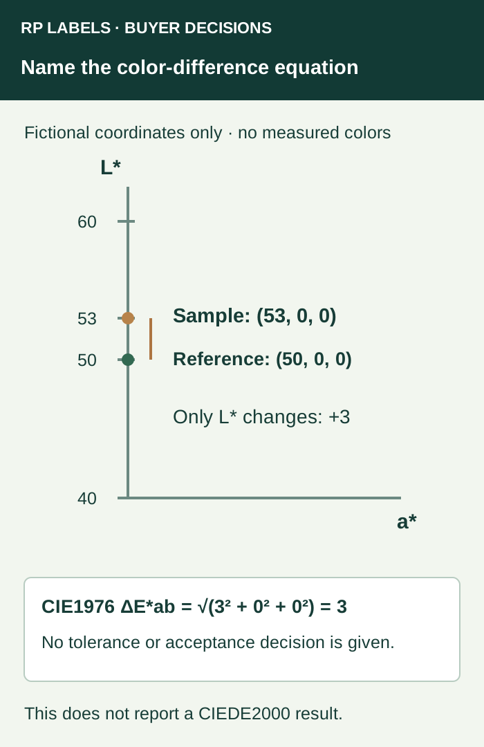
In this deliberately simple example, only L* changes. The CIE1976 result is the square root of (3² + 0² + 0²), which is 3. That arithmetic does not establish that a real label difference of that size is acceptable, nor does it report a CIEDE2000 result. Keep the named result attached to its equation.
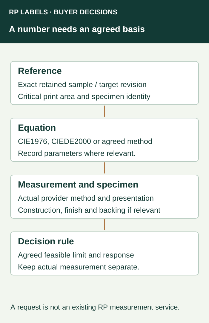
Ask the qualified measurement provider to record the actual reference identity, critical printed area, specimen construction, relevant instrument/method settings, illumination/observer basis and sample backing or presentation where relevant. For a clear label, identify whether the intended bottle or another defined backing belongs in that measurement. Confirm that the report represents the same finished layers the buyer is ordering.
If two reports use different equations or conditions, return the mismatch for clarification before ranking their numbers. If they share an agreed numerical basis but the physical pack still raises a visual concern, retain both observations and route the disagreement through the agreed review. The bottle-and-carton lighting guide addresses that distinct viewing dependency.
A brand that only needs an agreed physical appearance may retain a suitable visual approval rather than buying a numerical service without a purpose. Where a numerical requirement is real, include it with the retained-master reference in the RP inquiry and ask what measurement and reporting scope can be confirmed. Do not infer that a requested equation is already part of the quote.
Worked color reference record
The rows below are hypothetical planning examples. Empty observation or commercial fields must be completed from the actual project; no sample has been tested for this article. Use the worked CSV and blank worksheet with the field guide. Keep the example references separate from production records.
| master reference | component | critical area | substrate finish | proposed print route | proof scope | comparison owner | decision |
|---|---|---|---|---|---|---|---|
| DEMO-MASTER | Vial label | Teal logo | Actual film and finish required | CMYK candidate | Physical appearance reference to confirm | Brand owner | PENDING |
| DEMO-MASTER | Matching carton | Teal logo | Actual board and finish required | Spot or process route to discuss | Compare assembled set under agreed light | Brand owner | PENDING |
Bring this decision into the print inquiry
Contact RP Labels with the completed color reference record, the actual packaging reference, approved artwork and quantity per design. State which fields remain unresolved so the print specification and any relevant sample scope can be discussed against the same decision.
Related buying guidance: Custom peptide vial labels; Vial label color coding; Digital proof vs physical sample; Label materials and finishes.