Color-Coded Vial Labels: Give the Color One Meaning Before Adding Another SKU
The new research-vial label is green because the designer needed another color. On the existing range, green already identifies a different group. Both files look orderly on their own. Beside each other on the packing bench, the rule has become unclear.
This is a hypothetical brand-design problem, not a clinical color convention. If your private SKU system uses color as a cue, agree what that cue means before adding another artwork. Then keep a readable product name or code that identifies the vial independently of the color.
I would approve a written legend with the artwork, including who can change it and what happens when a proposed SKU conflicts with the existing rule. Buying another shade is easier than repairing a rule the team never agreed.
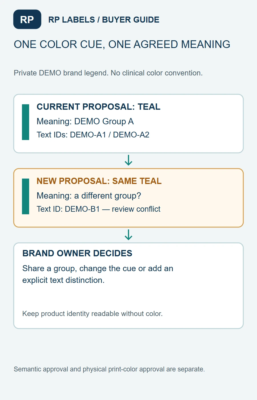
Brand-planning illustration. DEMO colors have no medical, specimen, formulation or industry-standard meaning.
Choose the attribute the color is meant to signal
Decide whether color represents a product family, an individual SKU or another buyer-defined grouping. Avoid letting it mean one thing on the vial and another on the accompanying artwork. A label's text may carry more detail than its color cue; that is often a sensible hierarchy.
The first example in the worked legend assigns a teal cue to a fictional group while separate text distinguishes two members. A later proposal uses the same teal for a different group. It is not automatically wrong to repeat a color, but the team must decide whether repetition changes the intended cue or requires another noncolor distinction.
This article does not assign colors to real substances, strengths, medical uses or laboratory specimens. Existing local or sector requirements must be considered by the responsible owner. A private product-marketing legend cannot override them.
Decide what stays stable when the range grows
Keep the product name, code position and relevant information hierarchy recognizable across the approved family. The designer can vary a band or accent without making each SKU a different visual puzzle.
Record the cue's scope. If color identifies the family, members may reasonably share it while their text codes distinguish them. If the team expects every SKU to have a unique color, it must confront what happens as the range expands or two chosen shades become difficult to distinguish in the intended setting.
Neither approach deserves a universal color-count limit. A compact family with stable product codes has a different task from a broad collection used across several packing sites. Choose the rule the responsible users can apply consistently, then check it with the actual artwork and intended handling context.
Make a color conflict a reviewed change
Before approving a new SKU, compare its proposed cue with the current legend. If it collides, record the available choices: retain a shared family cue, choose a different cue, add an explicit text distinction or reconsider the grouping rule. The product owner decides the meaning; the designer implements it.
Keep the former rule with its effective artwork references if the meaning changes. An old roll and a new roll can coexist in stock even when the screen folder contains only the latest files. Use the artwork-changeover guide for that separate inventory-release decision.
A slight color adjustment for print matching is not necessarily a change in meaning. Conversely, a nearly identical-looking color may carry an entirely different assigned role. Record semantic approval and physical color approval separately so purchasing knows what a reorder must reproduce.
Check whether the text survives without the color
Ask the intended reviewer to identify the product from the actual-size name or code when the color cue is unavailable or less useful. A grayscale proof can be a simple design challenge, but it is not a validated accessibility assessment or an inspection-system qualification.
Check the longest product name and the least distinct proposed pair, including the intended bottle and ordinary viewing arrangement. If the text is too small or ambiguous, adding a brighter band may not answer the identity question. The small-text guide addresses the separate reading task.
The alternative can be simpler. A readable text-first label with a modest family accent may serve a small range better than a large palette with weak names. A color-led arrangement can still help users locate a group quickly where the context supports it. Let the cue help the task without asking it to prove the identity alone.
Keep vial and carton evidence in their own scope
The vial-and-carton guide checks the identity that remains after unboxing. The visual-inspection guide checks what the applied-pack inspection should catch. This legend determines what the color is intended to mean before those later checks begin.
For physical color matching, identify the actual materials, finish and approved reference. The same screen value can appear differently on a carton and a vial label. Use the color-reference guide rather than assuming that a shared file value guarantees a shared appearance.
The worked legend, blank legend and field guide record grouping meaning, visible text, conflicts, ownership and effective artwork. Proposed rows stay pending until the brand approves them.
For custom vial labels, send RP Labels the current legend and proposed addition, actual vial size, text identifiers, artwork references and quantity per design. Ask for the family proof with the conflict visible. A consistent color system starts with a consistent meaning, not a larger swatch book.