Vial Label Dielines: Check the Cut Window and the Longest Real Content
The label looks balanced with a short sample lot and the cut line exactly centered. Then the real identifier grows longer and a narrow border makes every small cut shift visible. Treat the dieline as a window of practical production conditions, not a perfect rectangle that will always land on a screen pixel.
The hairline border makes the proof look precise. It also makes a small cut movement easy to notice. I would rather remove a fragile border than shrink an important identifier to defend it. The buyer still gets a considered design; the difference is that the design no longer depends on the die behaving like a screen cursor.
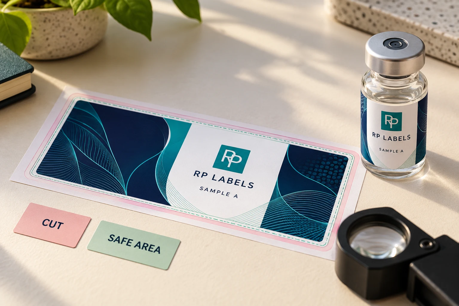
AI-generated packaging illustration. Fictional RP samples show the proposed decision; no physical test or customer order is documented.
Stress the content before releasing the cut file
Ask the converter for the applicable bleed, safe-area and cut-tolerance instructions. This guide supplies no universal millimeter allowance. Put those instructions beside the actual dieline revision so a designer cannot use an old allowance from another job. Keep the dieline, white layer and variable-field guides distinct from printable artwork.
The worked review checks two different risks: a decorative hairline close to the cut and the longest permitted identifier near the seam. Neither is automatically a reject. The designer should show what happens within the supplier's agreed production conditions, then choose whether to move the element, alter the design or discuss a different size. Enlarging the whole artwork to manufacture bleed moves the important content too.
Print at actual size with scaling disabled and wrap the proof on the identified vial. Read the smallest critical text from its intended viewing side. For codes, preserve the applicable margins and seek the relevant printed/applied checks. A safe-area check is not barcode verification, and an office-paper wrap is not adhesive qualification. Each evidence item should retain its own scope.
A borderless design can be a better choice than paying to defend a fragile decorative line. An established die can also be sensible when the information fits with enough room. Where the actual content cannot fit, return to the layout or label dimensions before treating the file as ready for prepress.
Send RP Labels the final dieline, actual vial reference, longest data example and separate production layers. The buyer should be able to point to the protected content and the agreed technical notes in the same proof.
Dieline: the finished edge, not decoration
The dieline is the vector path used to define the final label shape. It should sit on its own named layer or spot color and be set not to print. A screenshot, JPG border or hand-drawn rectangle is not a production dieline.
For a rounded rectangle, the corner radius belongs to the tooling decision. For a custom contour, avoid tiny notches and fragile points that are difficult to cut, strip and dispense. If the label will be machine applied, the shape must also release cleanly from the liner.
Bleed prevents accidental white edges
Cutting is controlled, but it is not a mathematical pixel operation. The cut can move within the approved production tolerance. If a navy background stops exactly at the dieline, a small shift can reveal a white sliver.
Extend backgrounds, photos and color fields beyond the dieline by the amount specified by the printer. Do not enlarge the entire design to create bleed; that moves text and logos too. Extend only elements intended to reach the edge.
The safe area protects what matters
Critical elements belong away from the cut: product name, dosage, concentration, lot field, QR code, barcode and mandatory copy. The safe area is not wasted space. It is the allowance that keeps normal trim variation from becoming a visible error.
On a small label, designers sometimes spend the allowance twice: first by placing copy near the cut, then by letting the vial curve hide the outer columns. The flat file looks full; the finished bottle looks crowded.
Buying rule: protect information before decoration. A border that varies slightly is annoying; a batch field clipped by the die or a QR code at the seam can make the label unusable.
The seam is part of the layout
A wrap label ends with either a visible gap or a controlled overlap. Mark that location in the proof. Keep the main logo, fine text and scanning codes away from it. An overlap can change color density where two layers meet, while a gap reveals the vial.
Do not center the front panel only by looking at the flat rectangle. Use the actual bottle circumference and the chosen seam width to calculate what the customer sees from the front.
Why tiny borders expose every tolerance
A thin printed border running close to the cut looks precise in Illustrator and often looks uneven after die cutting. The label may be within tolerance while the border makes a normal shift obvious. Either move the border inward, make it intentionally substantial or remove it.
QR codes and barcodes need quiet space
Keep the code inside the safe area, away from the seam and on the least curved readable panel. Preserve its quiet zone and contrast. Do not allow background icons or metallic effects to enter the empty margin.
Test the final-size code from the printed material on the bottle. A code that scans from a large office printout may fail after reduction, gloss, curvature and real lighting are added.
Use separate production layers
A useful file may include artwork, dieline, white ink, foil or holographic exposure and variable-data guides. Name these layers clearly. Keep technical marks out of the print layer and use overprint settings only where the printer instructs.
Outline fonts or package them according to the supplier's workflow. Link high-resolution images, preserve vector logos and avoid flattening the entire job into a low-resolution image.
Approve at actual size
- Print the proof at 100 percent with scaling disabled. - Cut along the dieline and wrap it around the actual vial. - Mark the seam and view the bottle from front, side and back. - Read the smallest copy without zooming. - Scan every code under ordinary light. - Confirm the batch or overprint area is large enough for the real printer.
Worked dieline cut window record
The rows below are hypothetical planning examples. Empty observation or commercial fields must be completed from the actual project; no sample has been tested for this article. Use the worked CSV and blank worksheet with the field guide. Keep the example references separate from production records.
| proof revision | element | risk location | supplier instruction reference | stress case | proposed action | owner | release state |
|---|---|---|---|---|---|---|---|
| DEMO-R1 | Thin border | Near finished cut | Actual tolerance guidance required | Review appearance across allowed movement | Move inward or remove if needed | Designer | PENDING |
| DEMO-R1 | Longest identifier | Near seam | Actual safe area required | Use maximum permitted data string | Reposition without reducing critical readability | Data and artwork owners | PENDING |
Bring this decision into the print inquiry
Contact RP Labels with the completed dieline cut window record, the actual packaging reference, approved artwork and quantity per design. State which fields remain unresolved so the print specification and any relevant sample scope can be discussed against the same decision.
Related buying guidance: Custom peptide vial labels; Gap vs overlap seam guide; Readable small text; Digital proof vs physical sample.