How to Approve Gradients on Printed Bottle Labels
Approve a label gradient against the proposed print condition and final label size. If the pale end disappears, stops abruptly or shows visible bands, ask prepress to identify whether the artwork, conversion or printing route causes the change before replacing the design. A screen preview alone cannot establish how a near-white tint will reproduce on the chosen stock.
For a supplement brand using a soft color fade behind its logo, the purchasing question is practical. Can the quoted construction reproduce the intended transition, and what reference will define an acceptable repeat order?
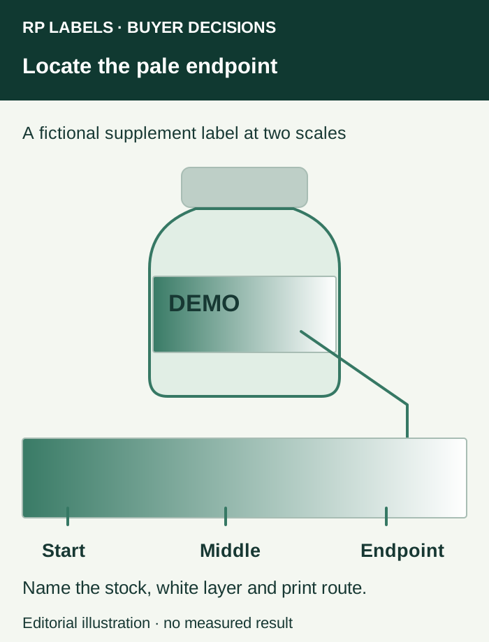
Give the fade an identifiable endpoint
Mark the beginning, middle and pale endpoint on a copy of the final-size artwork. State whether the fade must reach the unprinted background, end in a visible tint, or meet another colored area. These three intentions can require different prepress treatment.
On white material, an unprinted area exposes the face stock. On clear material, the endpoint may expose the bottle, its contents or an agreed white underprint. On a metallic base, reducing colored ink can reveal more reflection. Keep the white-ink map and substrate identified when comparing proofs. A smooth fade on a white desktop sheet can answer a different question from the same artwork on an amber vial.
Place critical text and codes on their own reviewed backgrounds. Moving a fade away from those fields can simplify the design while preserving its main visual purpose. The small-text guide covers that readability decision.
Separate file banding from the press highlight limit
An image with visible tonal steps can carry those steps into every later proof. A smooth vector or high-quality raster gradient can still change when separated, screened and printed. Ask prepress to inspect the supplied object and the production output, then identify the stage at which the unwanted transition appears.
Esko describes screening, minimum reproducible dots and press-specific tone reproduction as connected parts of flexographic prepress. Its documentation also defines the first-dot setting for an identified workflow. Those references explain why a universal minimum tint percentage would be unreliable here. Obtain the proposed converter's limits for this job. Esko flexo prepress guide, Esko first-dot settings.
If the faint endpoint is central to the design, request a proof or representative sample that actually covers that print condition. If only the overall composition matters, a layout proof may be sufficient for that stage while tonal approval remains open. A change from digital to flexographic production deserves a review of the gradient even when the artwork filename stays the same.
Compare deliberate alternatives at the same size
Ask the designer and converter to prepare alternatives only for the affected area. Keep the surrounding artwork unchanged so the buyer can identify what each revision solves.
| Proposed treatment | When to consider it | What the buyer should compare |
|---|---|---|
| Preserve the fade to the background | The disappearing endpoint is essential and the route can support it | Smoothness and endpoint on the intended background |
| Finish at an agreed visible tint | A subtle residual color is acceptable | Whether the ending looks intentional beside nearby areas |
| Replace the fade with a solid field | Clear separation matters more than a soft transition | Overall appearance and the effect on text hierarchy |
| Revise the print route or stock | The existing proposal cannot represent a critical effect | A new physical reference and the revised commercial scope |
These are design choices to approve with the brand owner. Quietly adding a tint floor during production can alter the design, just as insisting on the original screen image can leave an unprintable brief unresolved.
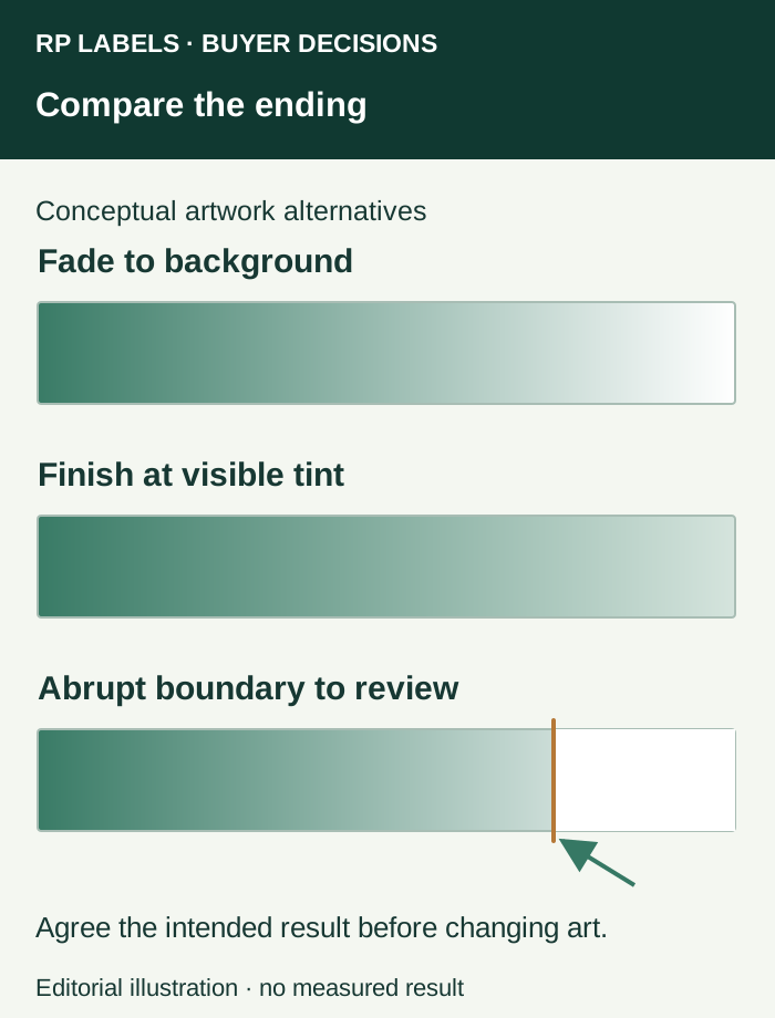
Use a compact tonal approval strip
Include the actual gradient plus a few identified points along it in the proof discussion. Label those points in the review document, outside the finished artwork. Ask which parts of the sample represent the final ink, face material, white layer, finish and production route. A simulated strip is a discussion aid until its relationship to the production condition is established.
Review the strip at normal viewing distance and at actual size, then inspect the pale end more closely. Record unwanted steps, an abrupt boundary, color changes and any interaction with the label background separately. Keep the lighting and reference specimen consistent across alternatives. A phone photograph can record the location of a concern, while the agreed physical sample remains the appearance reference where needed.
The buyer should pause tonal approval if the sample represents a different stock or if the reference cannot show the disputed endpoint. Prepress can still close unrelated spelling or layout corrections. The proof-scope guide helps separate those decisions.
Carry the approved treatment into the quote and reorder
Record the artwork revision, approved gradient treatment, material and finished-sample reference. Ask whether the quote includes any additional prepress preparation or proof work, and obtain the actual amount. Changing the fade is an artwork decision. Changing the production route can also change the purchase scope.
For supplement labels or small vial labels, send RP the final-size file, marked endpoint, container reference, quantity per design and preferred appearance reference. Ask which print and proof route can be proposed for that transition. This keeps the inquiry focused on a visible result the buyer can evaluate.