Supplement Facts on Small Bottles: Resolve the Space Deficit Before Print
A small bottle can look nearly finished while its information panel still does not fit. In a hypothetical artwork review, the quickest suggestion is to make everything smaller. That gives the designer an answer and leaves the buyer with another problem. First establish how much usable panel space exists and which text the qualified copy reviewer requires on that packaging layer.
The brand manager wants to keep the bottle that fits the gift set. The reviewer wants the approved information to remain readable and correctly placed. The designer is caught between them, moving a line a little lower each time. I would bring the measured panel and the final copy into the same review. Another smaller font is a decision too, and it needs a reason beyond making the proof look finished.
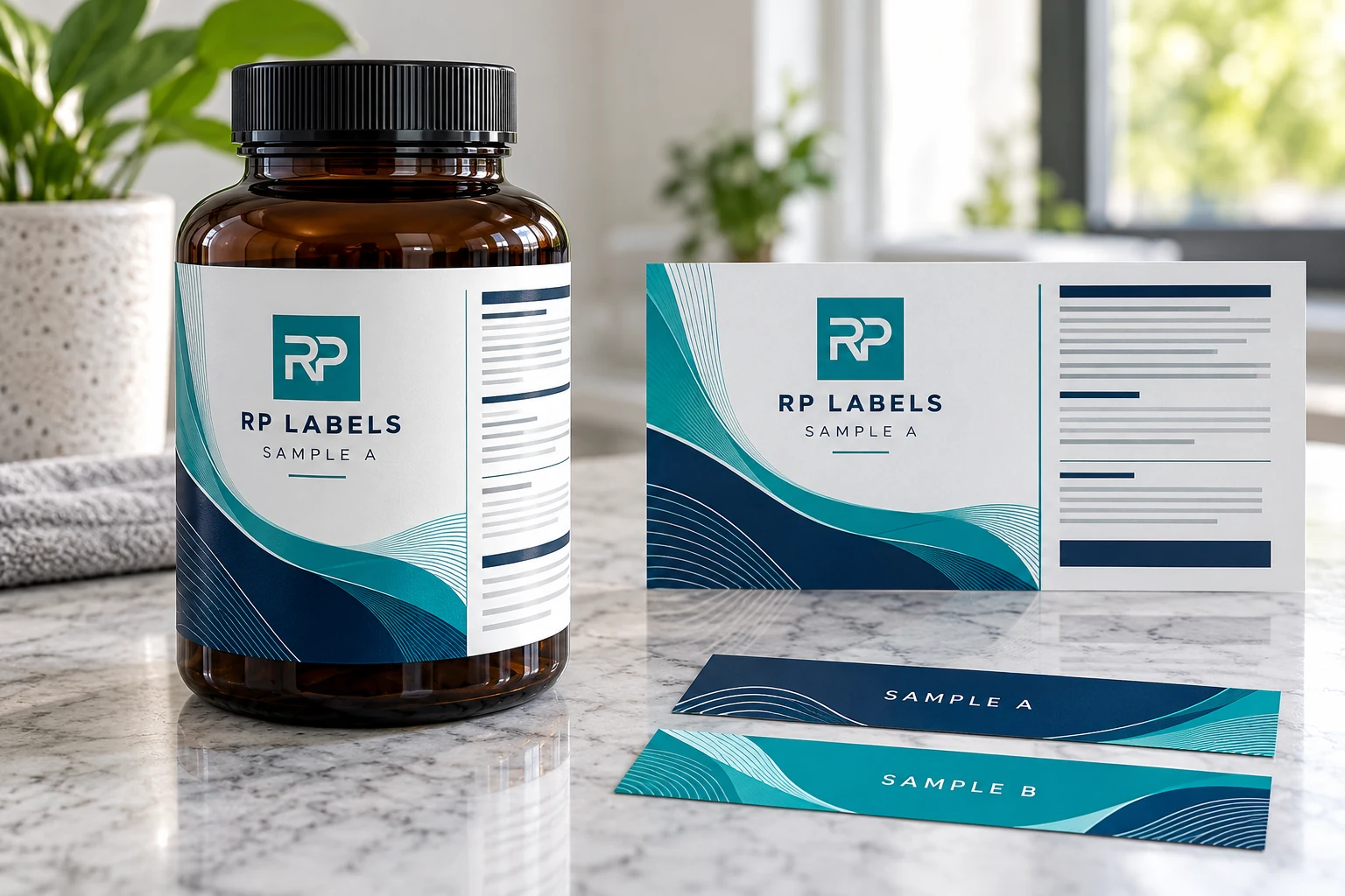
AI-generated packaging illustration. Fictional RP samples show the proposed decision; no physical test or customer order is documented.
Use a space decision record before another font reduction
Give every block of copy a reference and an owner. Separate the approved product information from optional marketing material, but do not let the printer decide the legal classification. The reviewer identifies what belongs on each layer and whether any alternative format is permitted for the exact product and package. The designer then works inside that confirmed brief.
The example worksheet compares two actions without pretending either has been approved. One removes an optional brand paragraph from the bottle. The other considers a different package or reviewed panel format. Both preserve the original approved copy file, so a smaller proof cannot silently become a shorter ingredient statement. Keep the old and proposed layouts side by side at actual size.
Ask the reader to turn the bottle and find the information, not merely inspect a flat rectangle. Record whether the panel crosses the seam, whether its background remains neutral enough for reading and whether another component obstructs access. Those observations complement the regulatory review; an attractive paper proof does not decide whether an exception applies.
A compact label with fewer optional words can be the best solution when the required content already fits in a permitted format. Where it does not, a larger label-bearing area or another properly reviewed packaging construction may be more practical than repeatedly compressing text. Do not assume that adding a carton permits removal of required bottle information.
The useful handoff contains the exact container, approved copy revision, measured panel area and the decision still open. RP Labels can review print layout within that scope. The buyer's qualified reviewer retains responsibility for the information allocation and final content approval.
Separate legal copy from sales copy before design starts
Create two lists. The first contains copy required for the target market and product category. The second contains optional marketing language, icons, flavor notes and decorative claims. Required information receives space first. Optional content is edited, moved to a carton or removed when it competes with readability.
For products sold in the United States, the FDA dietary supplement labeling guide identifies core statements such as the statement of identity, net quantity, nutrition labeling, ingredient information and the name and place of business of the manufacturer, packer or distributor. The exact layout and any exemption depend on the package and product. Use the FDA Dietary Supplement Labeling Guide as a primary reference and have the final copy reviewed for the intended market.
Measure available label space, not the bottle silhouette
The shoulder and base curve are not reliable areas for dense information. Measure the straight-wall height, bottle circumference and the gap you want between the label ends. Leave room for manufacturing tolerances and avoid placing a barcode, table rule or narrow text directly on the closing edge.
| Front panel | Product identity, variant and net quantity need a clear reading order at normal viewing distance. |
|---|---|
| Information panel | Reserve a calm, high-contrast zone for Supplement Facts, ingredients and business information. |
| Scan zone | Keep UPC and QR codes away from the tightest curvature, seam and glossy visual clutter. |
| Production zone | Plan fixed areas for lot, expiration or variable data before the artwork is approved. |
Use the right panel format instead of guessing
The standard vertical panel is familiar and efficient when the bottle has enough height. A short, wide label may be better suited to a tabular arrangement, while certain small packages may qualify for a linear format or other special provisions. The FDA nutrition-labeling chapter discusses small and intermediate packages, including format and type-size exceptions. Review the current FDA nutrition labeling guidance with a qualified regulatory reviewer before using an exception.
Do not redraw the panel from a screenshot. Build it from approved product data using a controlled template. Rules, headings, line spacing and alignment should remain consistent after the panel is placed into the final dieline.
Readability is more than font size
Type size matters, but so do weight, line spacing, character width, background contrast and print gain. Condensed type can save horizontal space, yet an overly narrow font becomes tiring at small sizes. Reversed white text on a dark field may look premium on the front but is often less forgiving for dense facts and ingredients than dark text on a light neutral panel.
Print the proof at 100% on ordinary paper, trim it and wrap it around the bottle. View it under office light and retail-like light. If the facts panel only looks comfortable when zoomed on screen, it is not ready.
Keep the barcode and variable fields out of the squeeze
A barcode needs enough quiet space and usable contrast after it is wrapped. A QR code also needs a stable module size and a clean border. Test both on the finished bottle rather than only on a flat PDF. Batch and date fields need a defined printing method, background and maximum character count so production data does not collide with nearby copy.
Use the carton when the bottle has reached its limit
A matching carton can carry extended directions, brand story, secondary languages or supporting information while the bottle remains readable. This does not remove any information that must appear on the immediate container, but it can prevent optional copy from overwhelming the label. Ask the compliance reviewer which statements must remain on each packaging layer.
Worked facts panel space record
The rows below are hypothetical planning examples. Empty observation or commercial fields must be completed from the actual project; no sample has been tested for this article. Use the worked CSV and blank worksheet with the field guide. Keep the example references separate from production records.
| copy block | copy revision | placement owner | current space issue | candidate action | review required | decision |
|---|---|---|---|---|---|---|
| Optional brand paragraph | DEMO-R1 | Brand owner | Competes with information panel | Remove or relocate optional paragraph | Confirm no required content removed | PENDING |
| Approved Facts content | Actual file required | Qualified copy reviewer | Panel does not fit current draft | Review permitted format or package change | Exact product and packaging review | PENDING |
Bring this decision into the print inquiry
Contact RP Labels with the completed facts panel space record, the actual packaging reference, approved artwork and quantity per design. State which fields remain unresolved so the print specification and any relevant sample scope can be discussed against the same decision.
Related buying guidance: Custom supplement labels; Supplement bottle label size guide; Barcode and QR placement guide; Supplement label materials and finishes.